Alle Beiträge von seidenpriester

modern architecture – Yokohama

Like the other articles about architecture also this one is under construction …

In Yokohama you have to know that the whole harbour area was redesigned in a project called Mirai 21. The Queens Plaza and the Landmark Tower are the center of this new area. Another architectural highlight is the pilot office at the harbour and the old brick warehouses. You should visit the area at night.
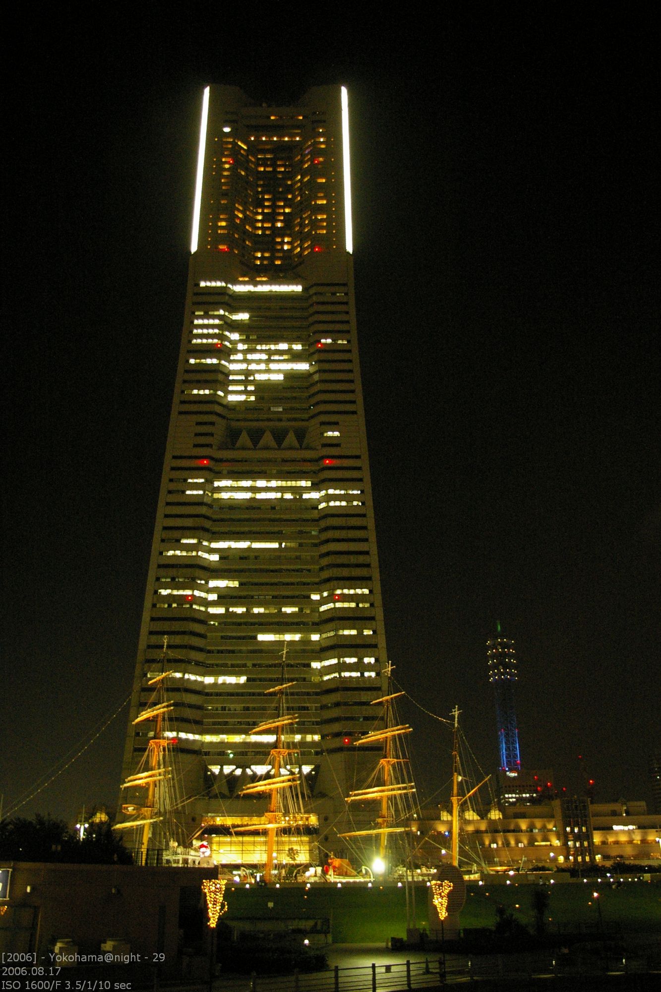
Landmark Tower
Landmark Tower

Height: 70 floors / 298,5m
Building Time: 03/1990 bis 07/1993
Architect: H. Stubbins & Associates

Before the completion of the Sky Tree in Tokyo, the Landmark Tower was the highest building in Japan. While the Sky Tree is a TV tower, the Landmark Tower is still the highest office / hotel building.

The building is splitted into two functional areas. The lower floors are a shopping mall with 160 shops. Above that until the 48th floor are office space. Above this floor is the Royal Park Hotel. At the floor 69 is a sight seeing platform called „Sky Garden“. The elevator was the fastest in the world (in 2004). He reached 750m/min. The whole ride takes less than 50 seconds including closing the doors.
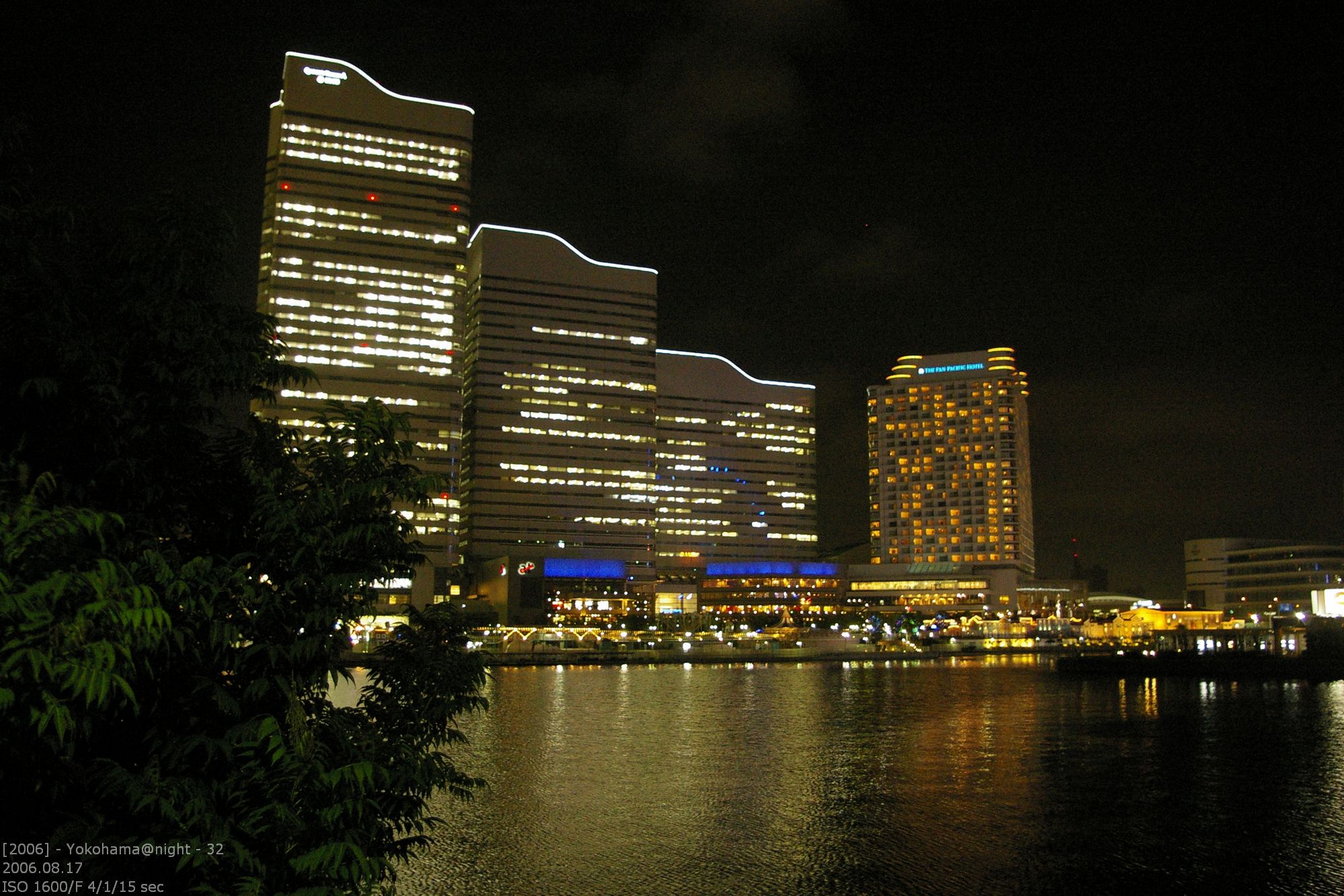
Queens Plaza
Queens Plaza

The Queens Plaza is a complex of three buildings that are connected at the basement level. In the core of building is the subway station. The station is totally integrated into the building. On on edge of the three buildings is a nose along the whole height.  It is very good to see if you are looking down from the Landmark Tower. The nose is there to break the air stream caused by wind. It prevents turbulences and reduced vibrations of the building.
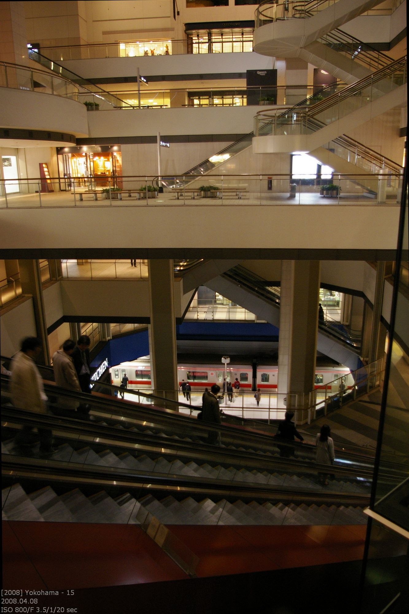
Station Core
Station Core

In the Mirai 21 project a part of the old train tracks was remodelled as a sidewalk. The tracks are still there and filled up with wood. The Navios Yokohama was built above this sidewalk.
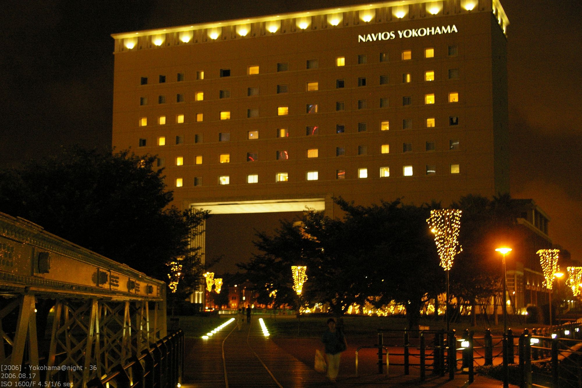
Navios Yokohama
Navios Yokohama

The train tracks are leading from the Landmark Tower to the brick warehouses. 2010 there was unused space to pass. Looks like Mirai 21 is still not complete.

Ware Houses Yokohama
Warehouses in Yokohama

The warehouses are unchanged on the outside. The didn’t touch a thing. The just added big glass elements in the former doors. That was the best thing they could think of. At night, of the buildings are illuminated in yellow/orange light, it looks like the steels frame of the building is glowing. Behind the thick walls are several restaurants and bars. This is a good example for reviving and old object with only tiny, nearly invisible changes.

Lotsenstation
Lotsenstation

Not accessable for tourist but still an eyecatcher is the pilot station. It is one of the most important buildings of the Japanese Avantgarde.

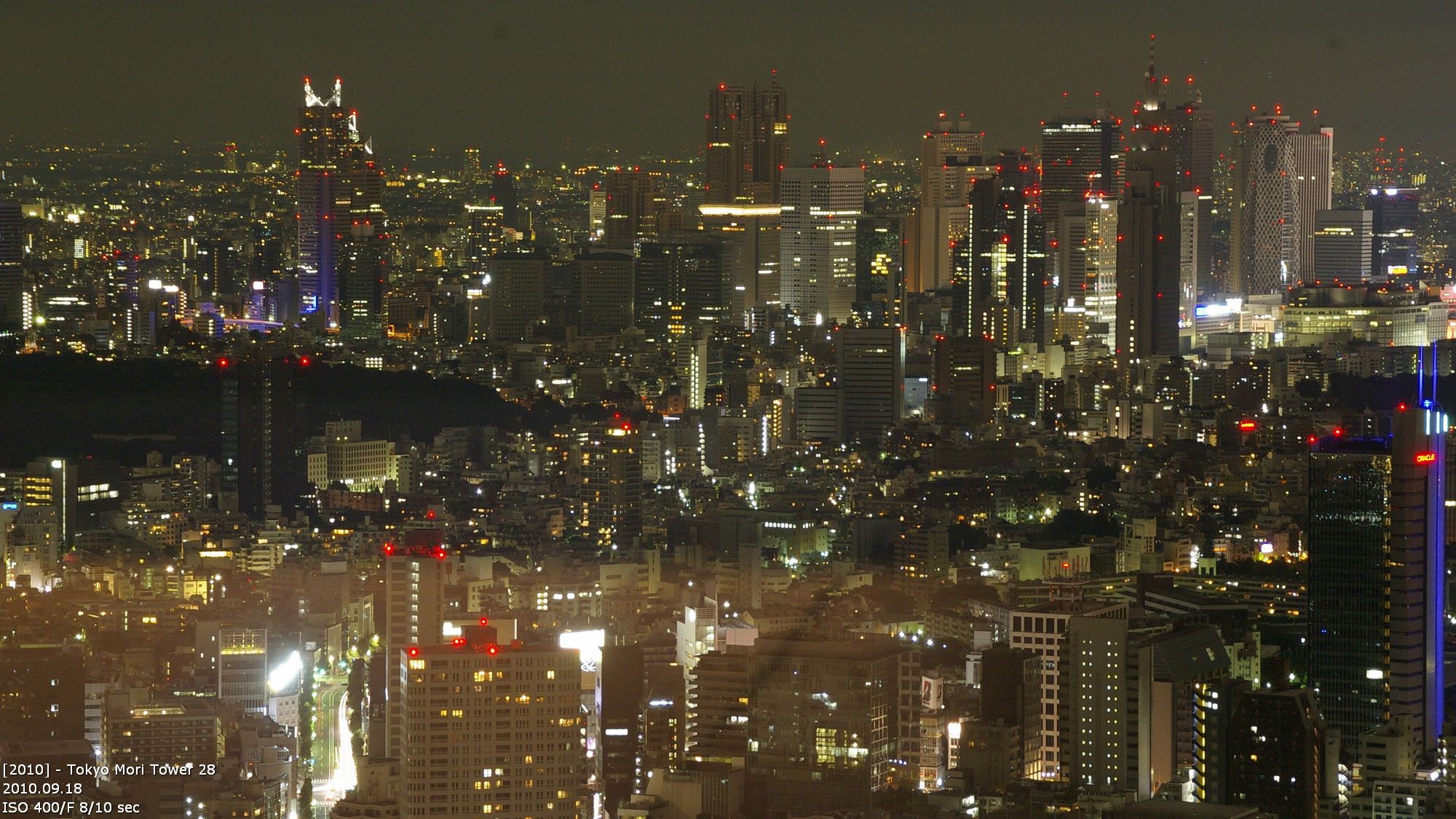
Yokohama is a good example that japanese architect are designing their buildings for the night. Nowehere else is the impact of an building that powerful at night. And only at night. During the day they are more or less gray blocks of the steel, glass and concrete.

deutscher Blogeintrag

modern architecture – Oosaka

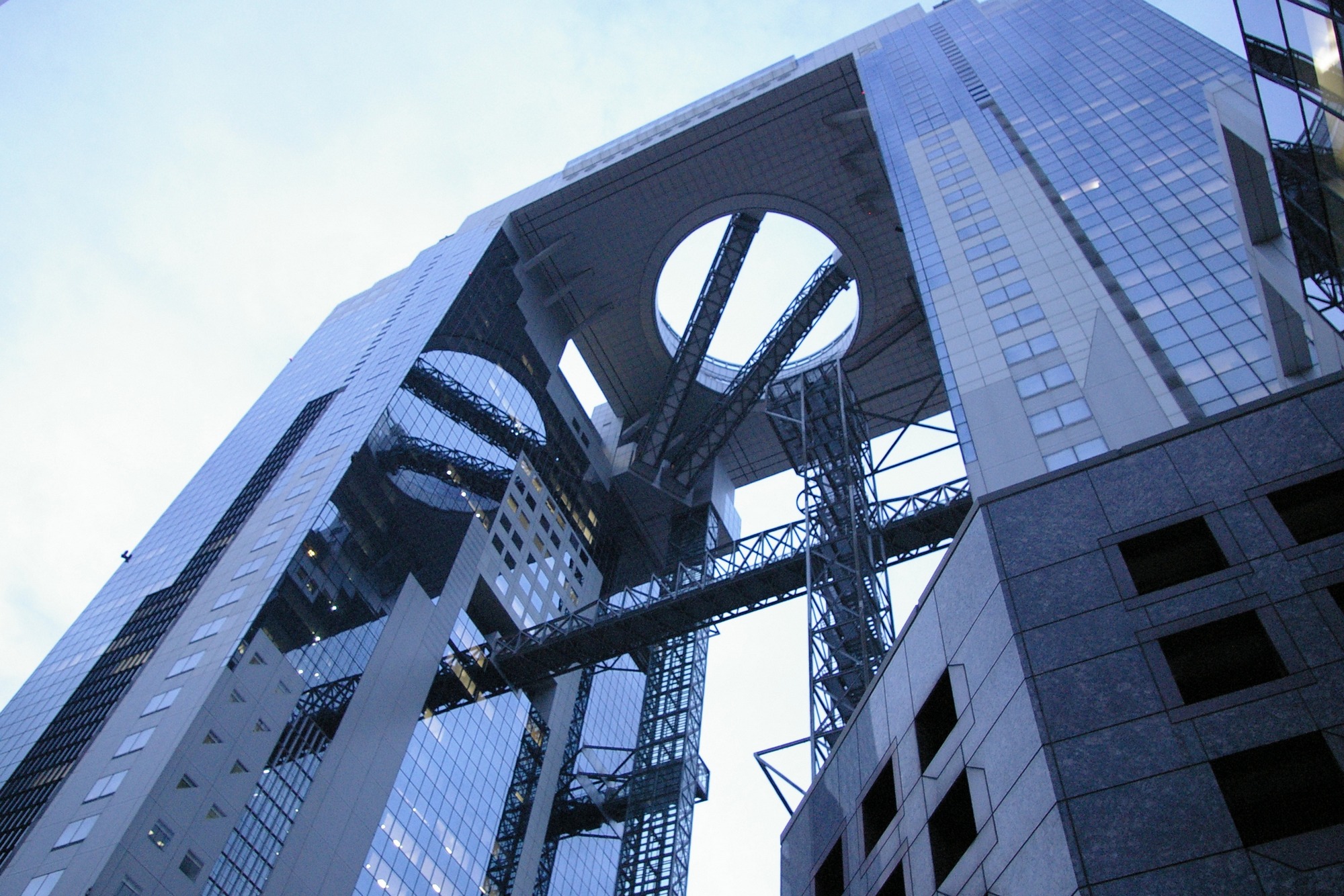
Only one article for Oosaka isn’t fair but I was only for two days in Oosaka with a digital camera. And I focused on the tourist attractions. Architecture wasn’t may aim at that time. But even then, one building was outstanding. At it is in walking distance of Umeda station. It also has a obeservation platform on the roof.

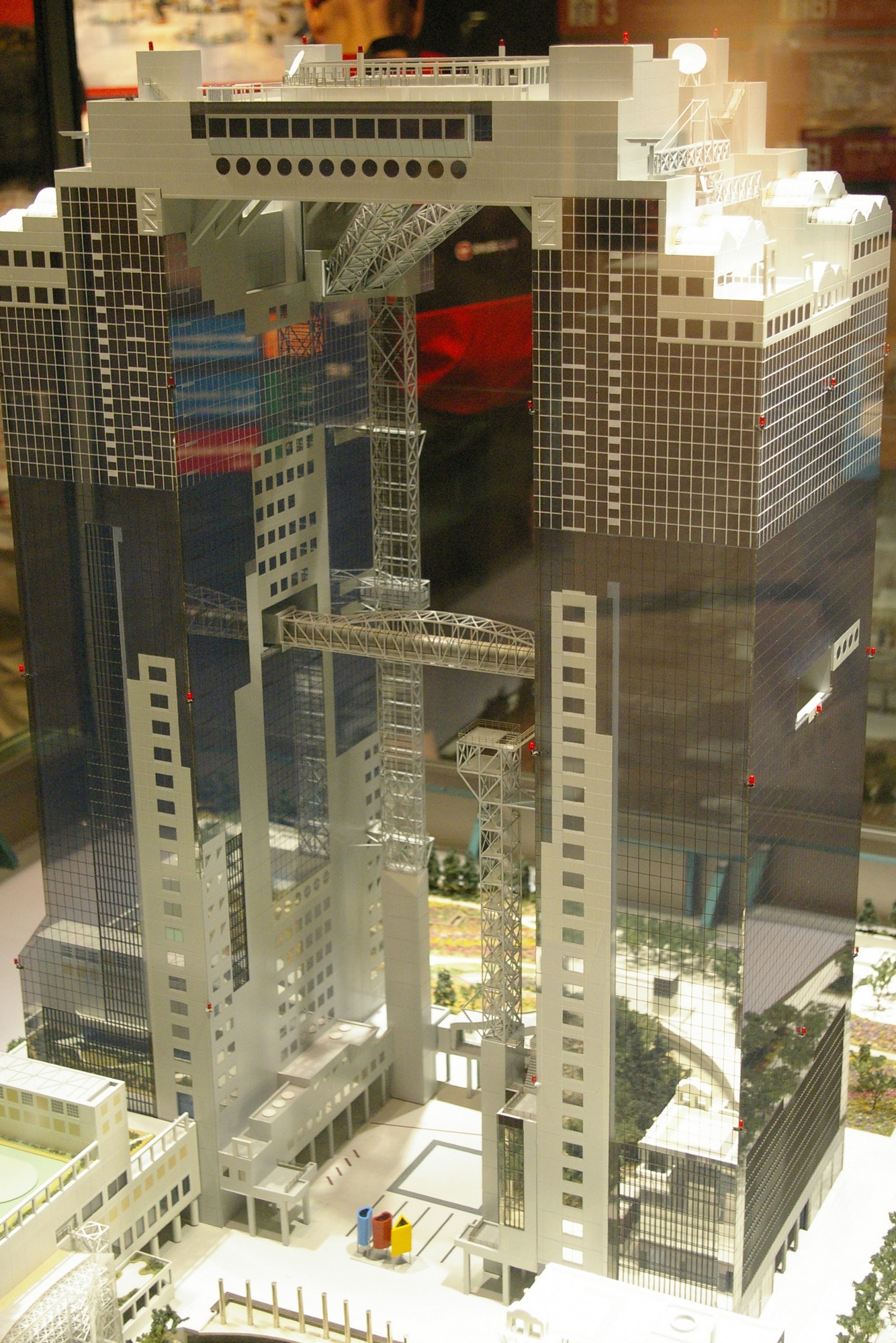
Umeda Sky Building (梅田スカイビル)
173m (43 floors), Architekt: Hiroshi Hara, 1993

The building ins’t that high, but it’s concept is unique. It looks like a upside down U with a hole. The both towers of the building are connected at the top by a platform with a restaurant. A special elevator is ending below the platform. From there two elevator are leading to the restaurant area. The platform with the restaurant has a hole in the center. This panaroma glass front provides a good view down. It is obvious that the restaurant and the observation deck above was planned from the beginning. A common approach in Japan for high buildings, that tend the become the city landmark. The approach surely was taken over from the radio towers of the 1950ies („Eiffel Towers“).

The building was designed by Hiroshi Hara and was part of the „City of Air“ project in 1988. Originally there was a plan for 4 connected building but only two were realized. The opening was in 1993. The oberservation deck is called The Floating Garden Observatory.

Other buildings worth mentioning

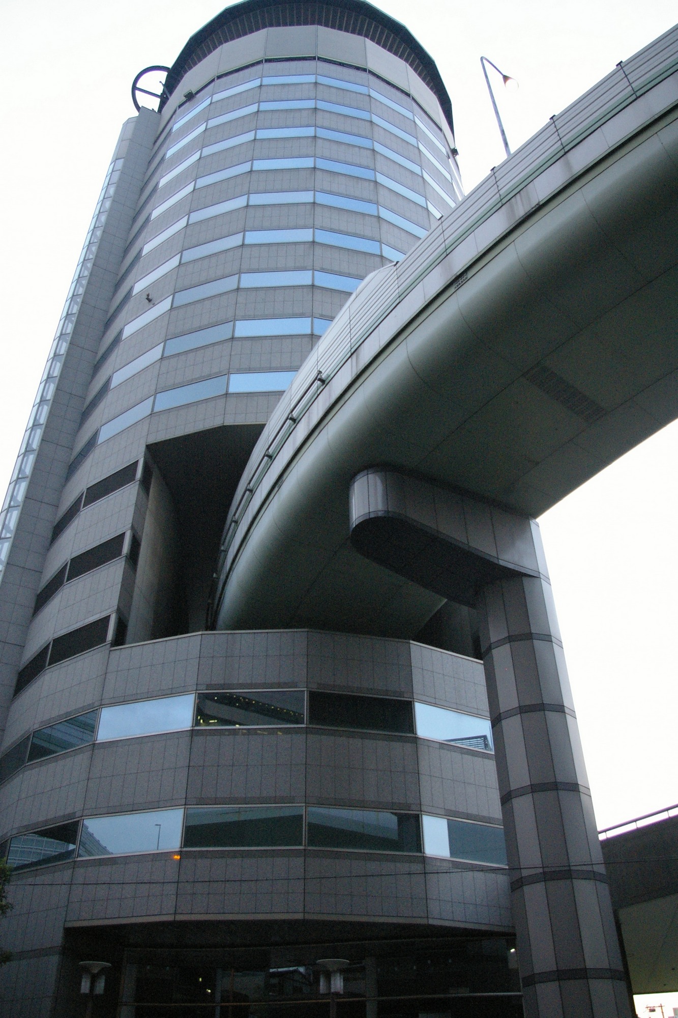
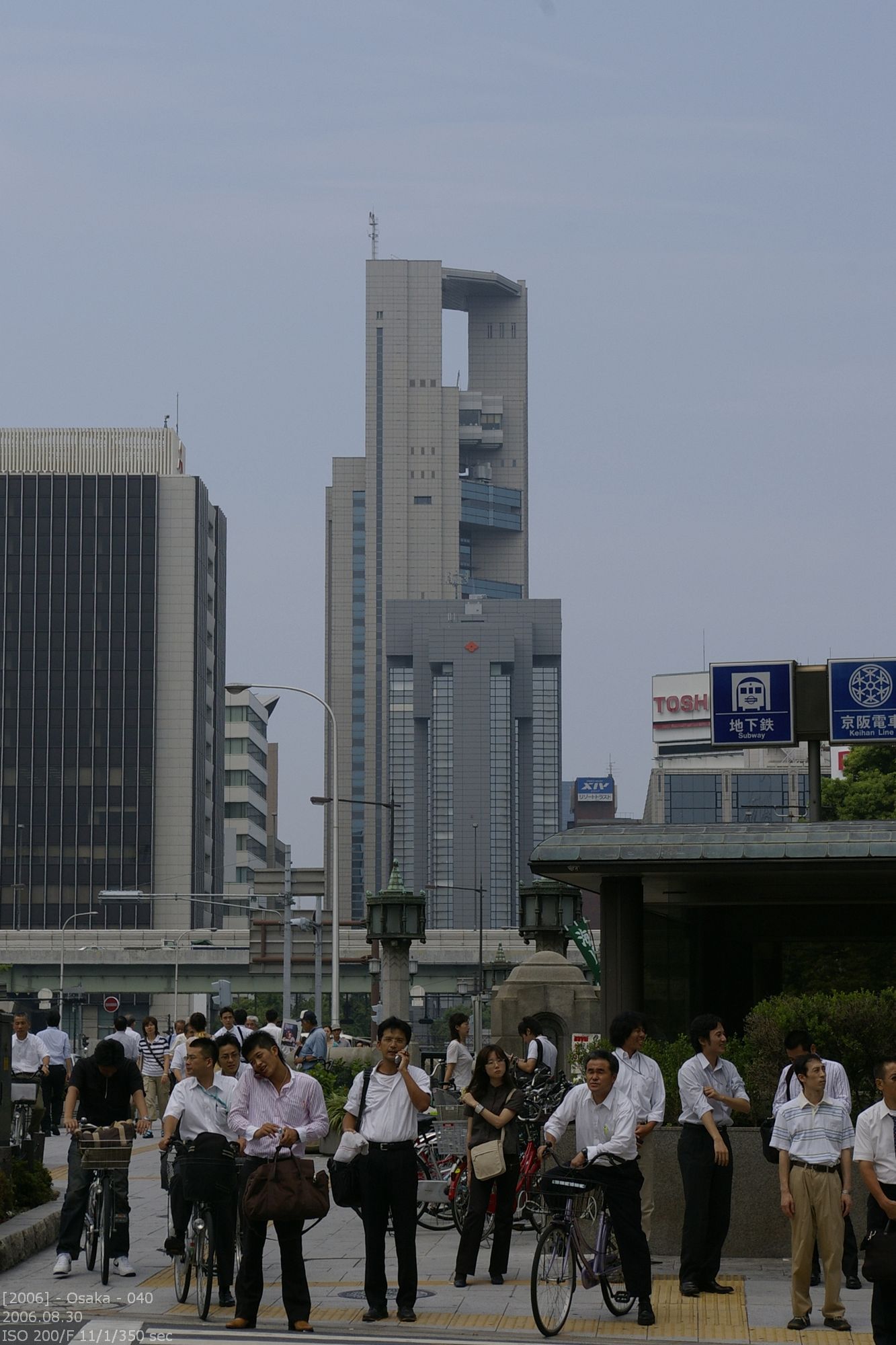
I don’t verified the identity of the left building. I will provide more information later.  The right building is for sure an eyecatcher. The on-ramp of the expressway is going right thru the building. This happens above the 5th floor. But the street is on no point connected to the building. Therefore no vibrations are transmitted to the building.

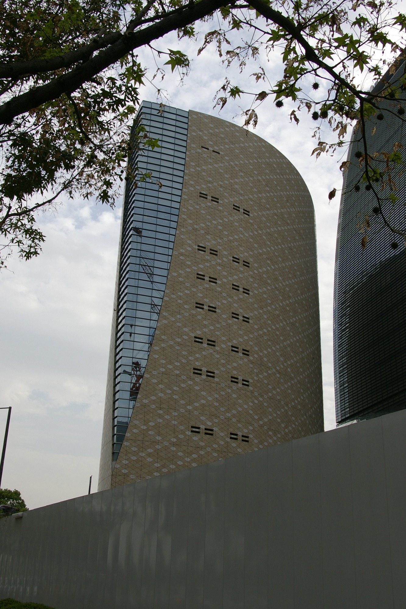
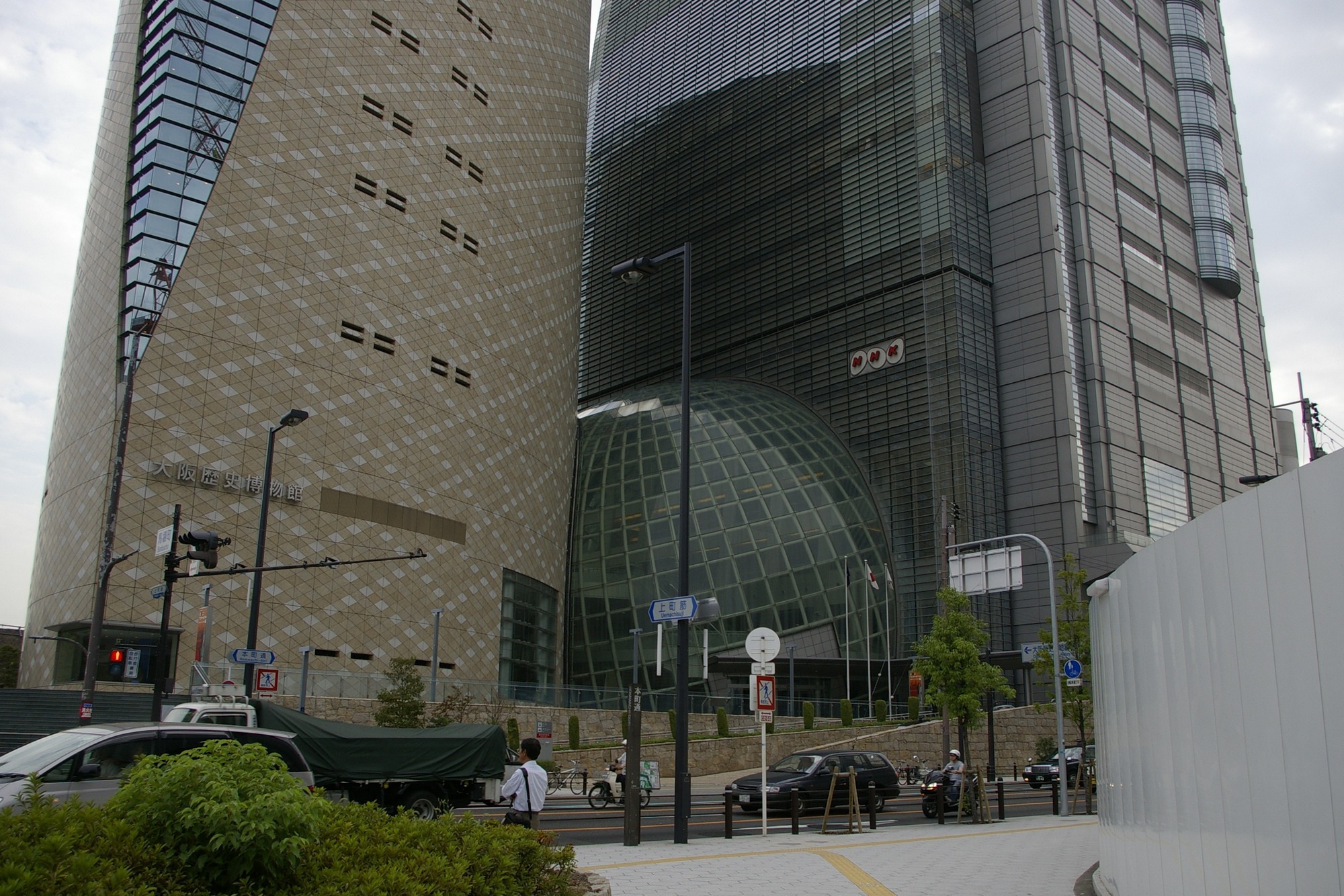
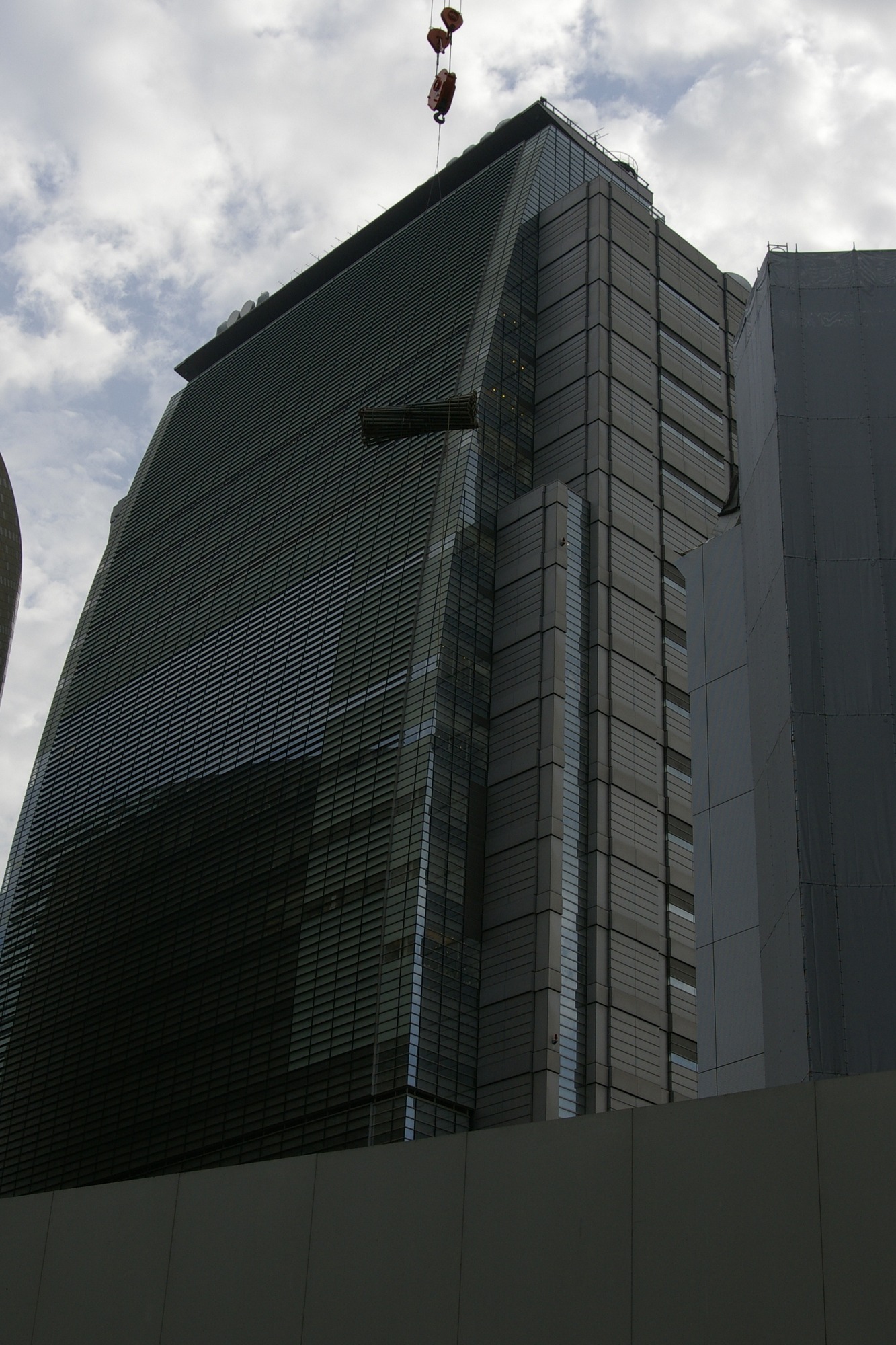
NHK building and the museum of Oosaka

Both building are sharing the entrance hall, which is optically a part of the NHK building. The design of the museum is independent from the NHK design. But even if they are so close together it doesn’t bother.

deutscher Blogeintrag

modern architecture – Nagoya

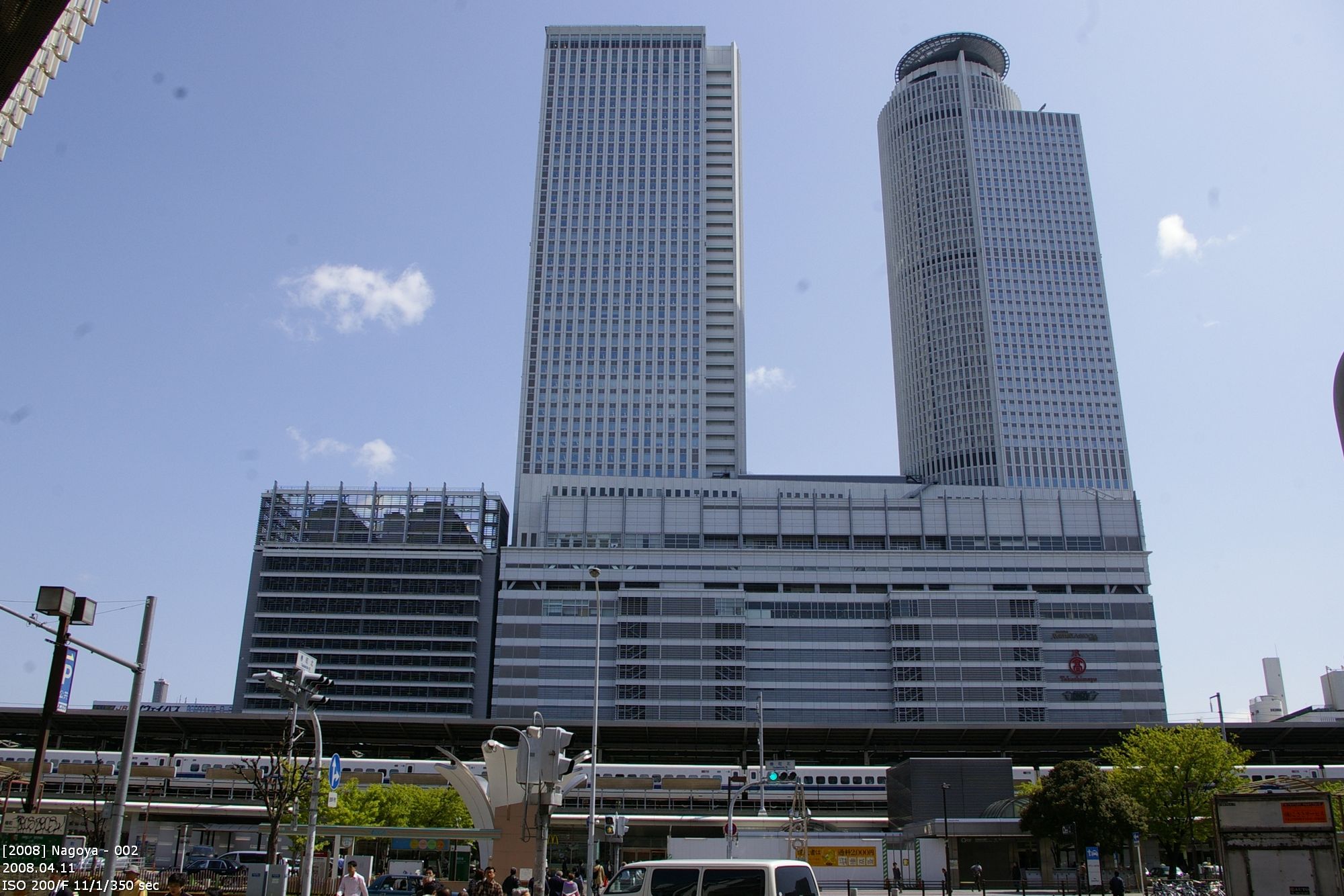
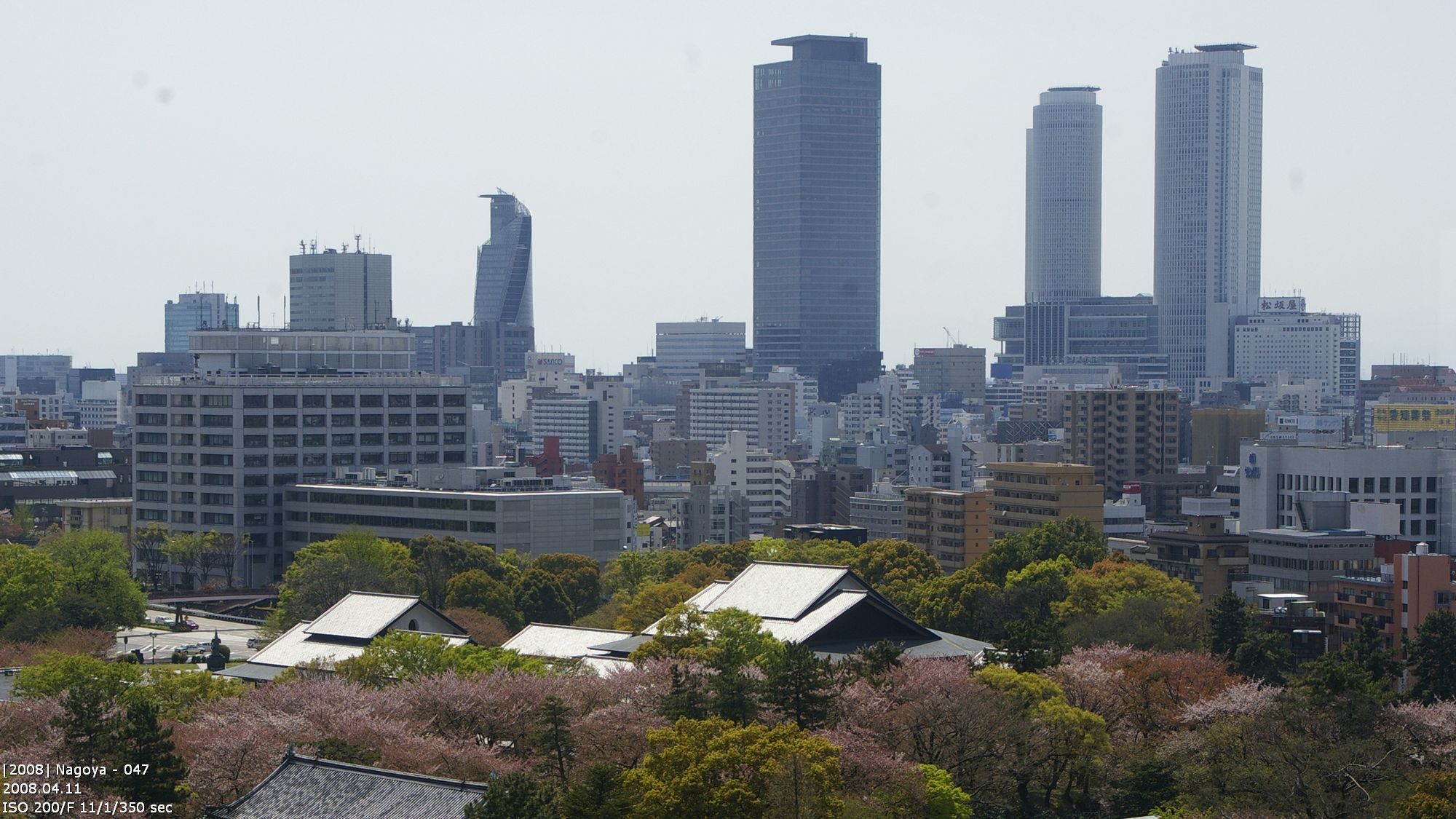
The building as two sections. The lower section is the train station. Above there are two towers: The JR Central Hotel Tower (left side, 59 floors) and the JR Central Office Tower (right side, 55 Etagen + Helipad). There is a restaturant in the uppermost floor of the Hotel Tower. This is some kind of a standard in Japan.

Modern architecture is not limited to Tokyo, it is only one of the biggest hot spots in the world. If you travel thru Japan you realize that train stations are epicenter of urban development. You cannot see that in Tokyo and Shinjuku because of the density of the buildings there. But you can see it in Nagoya. With its 40 and 59 floors the station building is visible even from far away.

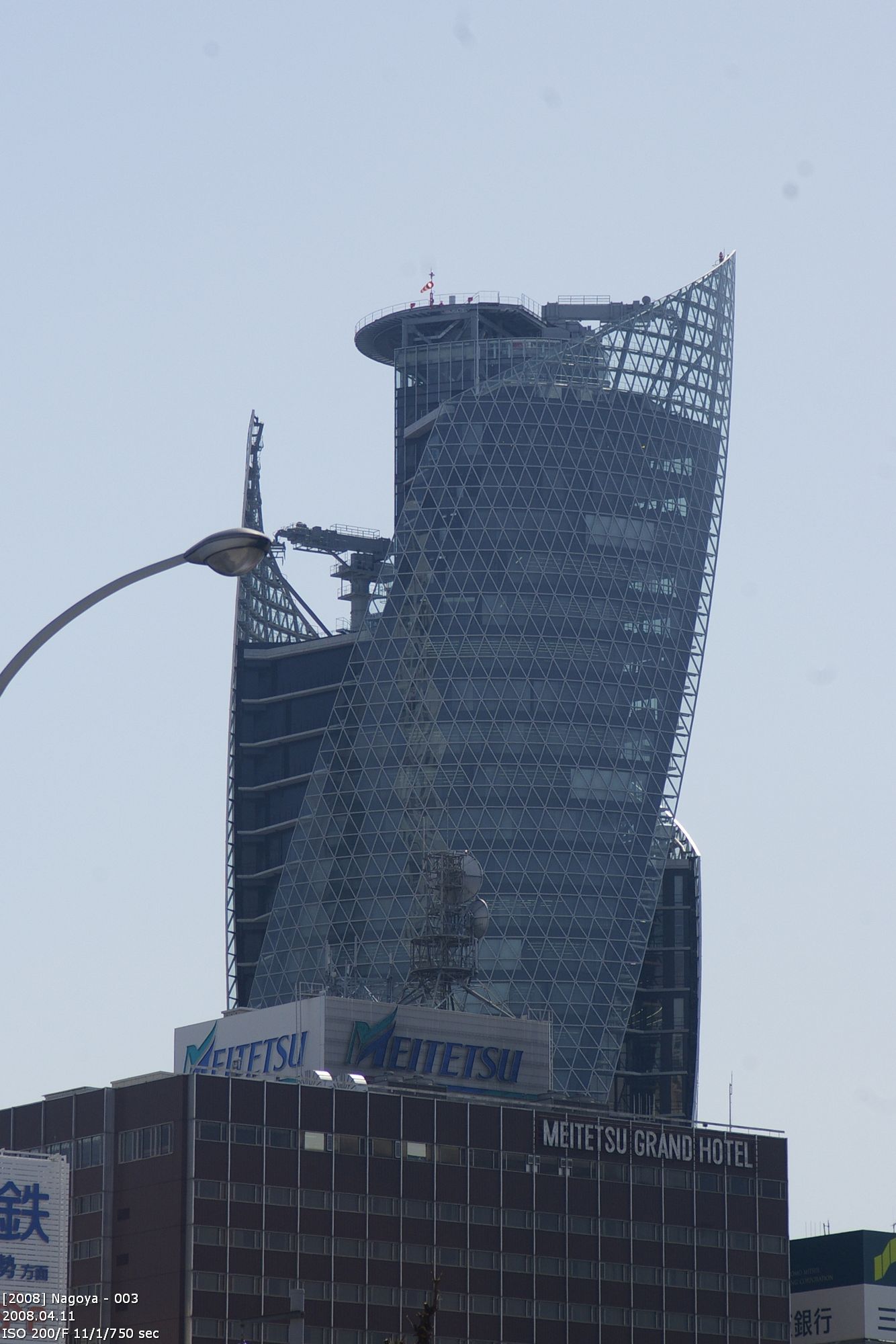
Mode Gakuen Sprial Tower
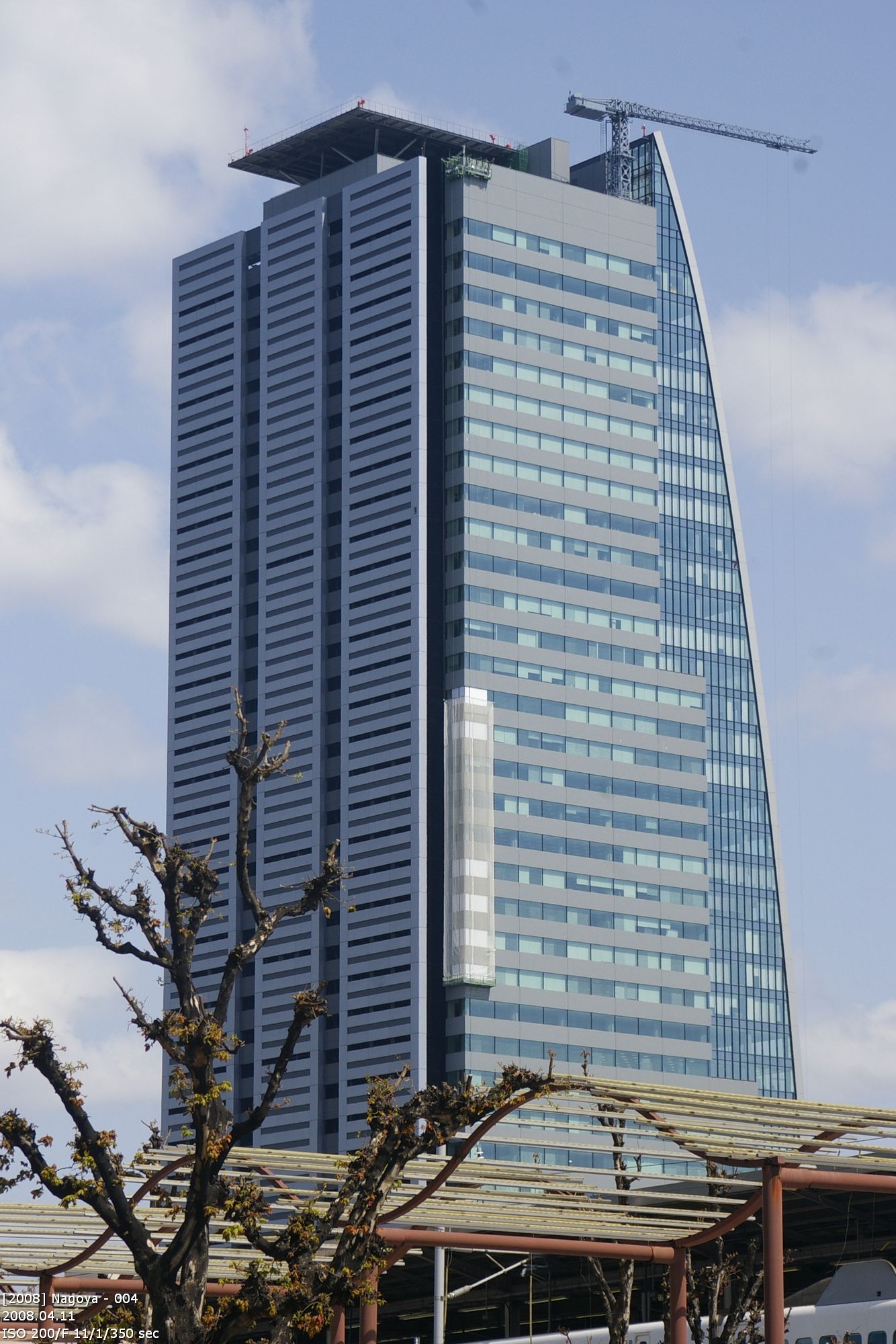
170m, 36 floors; 2005-2008; architect Nikken Sekkei

Next to the train station is the Mode Gakuen Sprial Tower of Nagaoya. Like the Mode Gakuen Cacoon Tower in Tokyo it houses a fashion school. Architect in charge was Nikken Sekkei. The building is with 170m (36 floors) one of highest buildings in Nagoya. It was built in 2005-2008. The picture is from 2008, right after the finished the work.

Spiral Tower and Lucent Tower

Nagoya Lucent Tower
180m, 40 floors

The Lucent Tower is with 180m (40 floors) the 4th tall builing in Nagaoya. On the panorama you can see he the 4 buildings stand out to the rest of Nagoya.

Nagoya City Hall / Aichi prefecture office

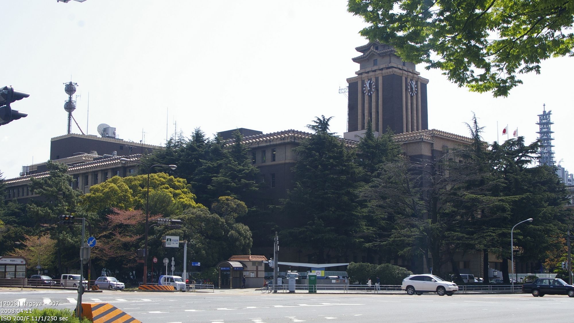
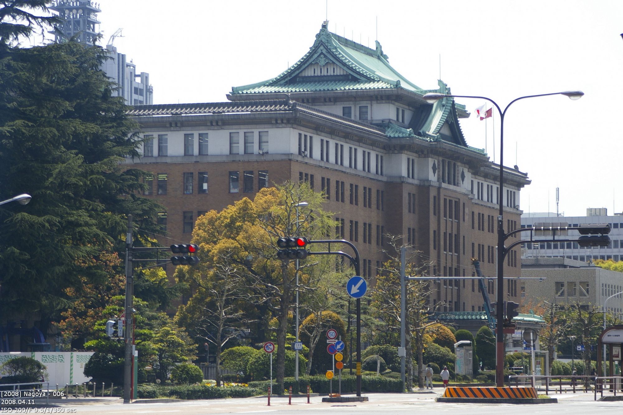
Away from the train station and next to Nagoya Castle are two older buildings I have to mention in this blog: Nagoya City Hall and the Aichi Prefectural Government Office. At both building the archtects played with classical japanese elements. The shape of the roof of city hall is like the shape of old temples. The government office uses the castle as a reference for its roof shape. The rest of the buildings is western style and creates a harsh contrast. The resulting tension between both styles is discussed until today.

 deutscher Blogeintrag

modern architecture – Shiodome

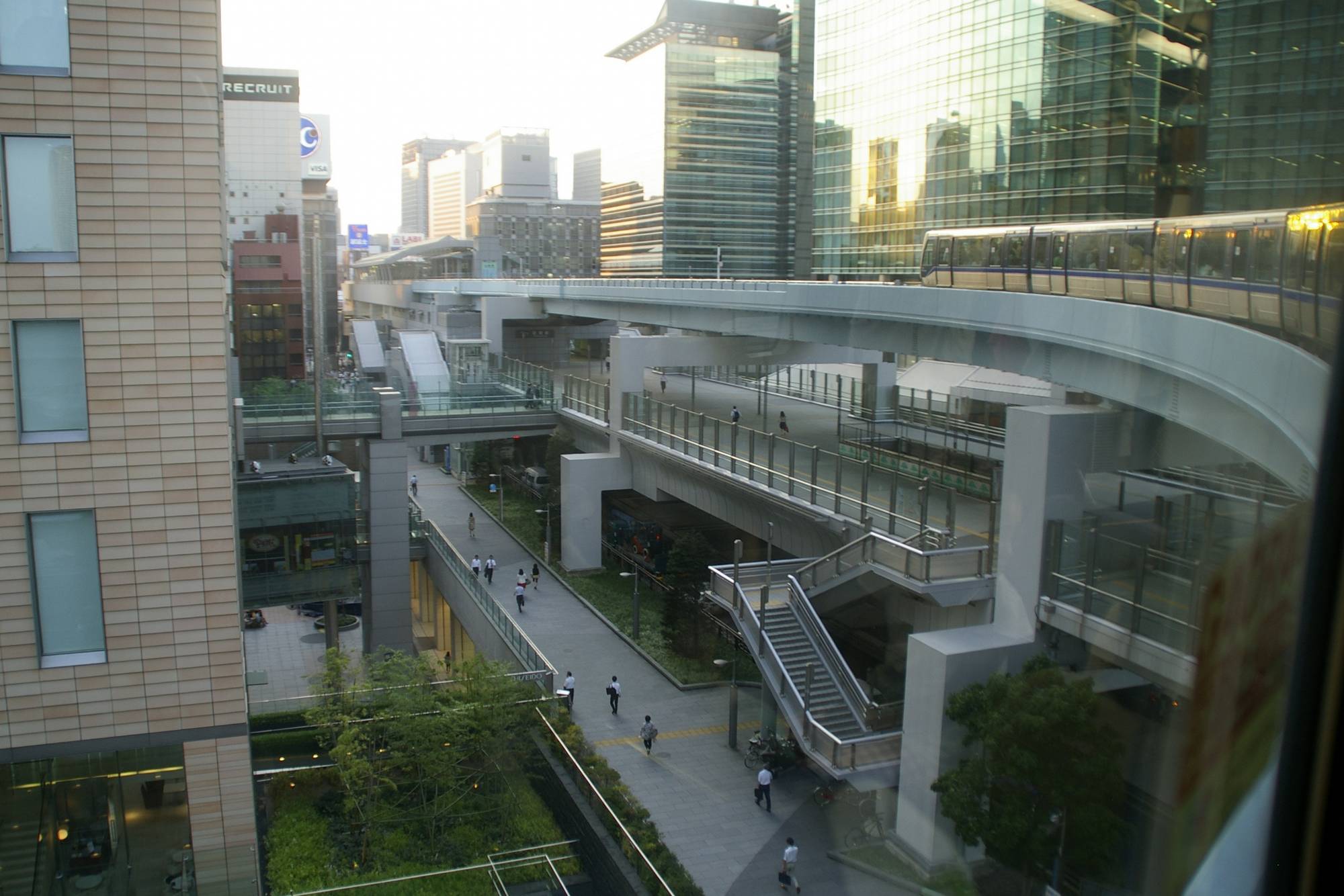
The Tokyo metropolitain area has many centers. Shibuya and Shinjuka are well known. A smaller one is Shiodome. A small spot south of Ginza. Tourist should memorize this place. Next to Shiodome is Hamarikyu Teien. One of the most beautiful japanese Garden in Tokyo. The famous fishmarket is close by. And in Shiodome the monorail across the Rainbow Bridge to Odaiba starts. It is also the place where you realize that Tokyo is 3D.

Shiodome is urban architecture and modern city development. Shiodome is the place where the word „ground level“ does not exist. Even the existence of trees is not a prove that you are at this level. You may be above or below. Stop thinking in 2D. Shiodome is the begin of science fiction, where city grow into the sky, where the different infrastructures pf the cities are stacked. The end of this development would be a city like in „The fifth element“.

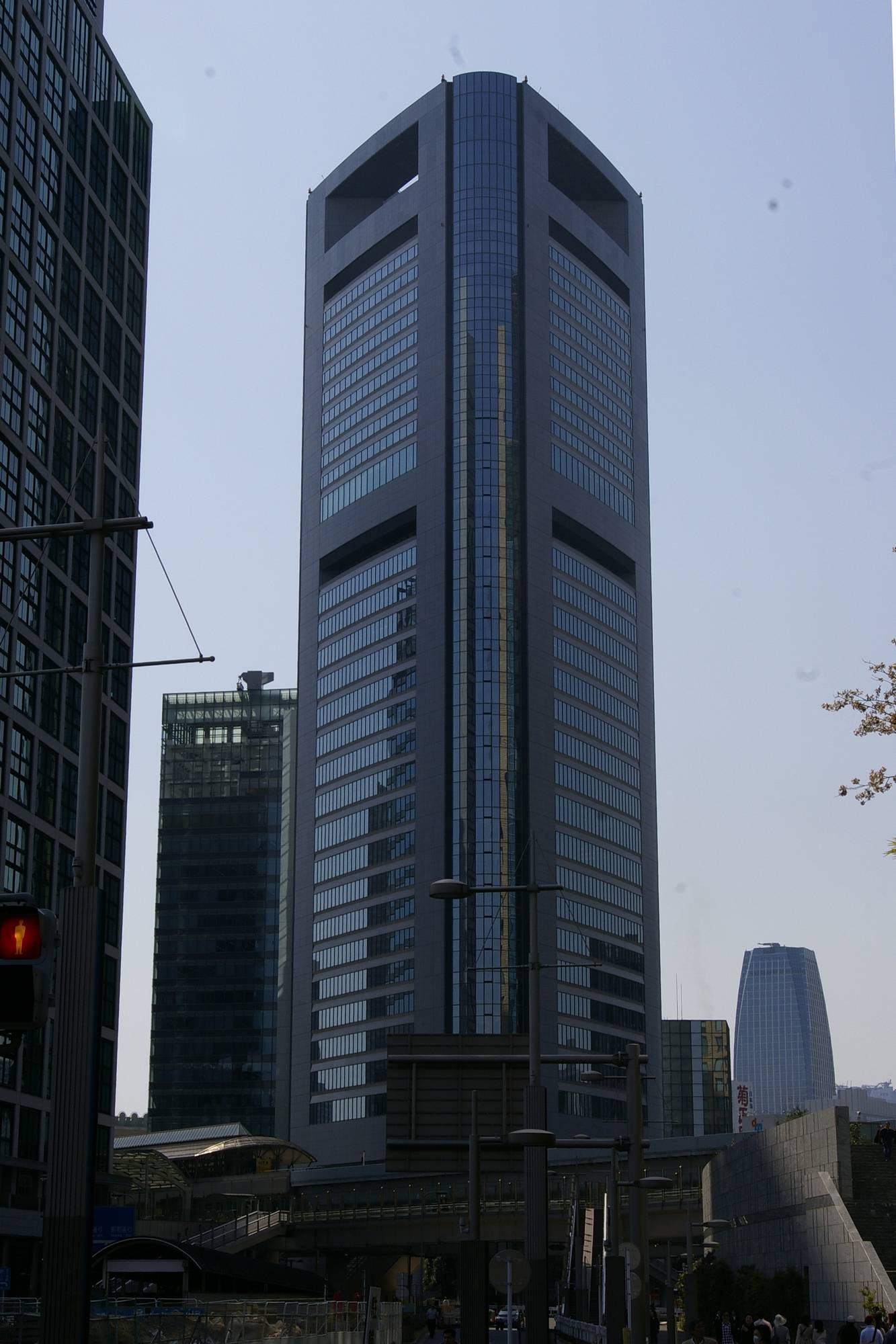
Nippon Television Headquarter
Rogers Stirk Harbours + Partner, 2003

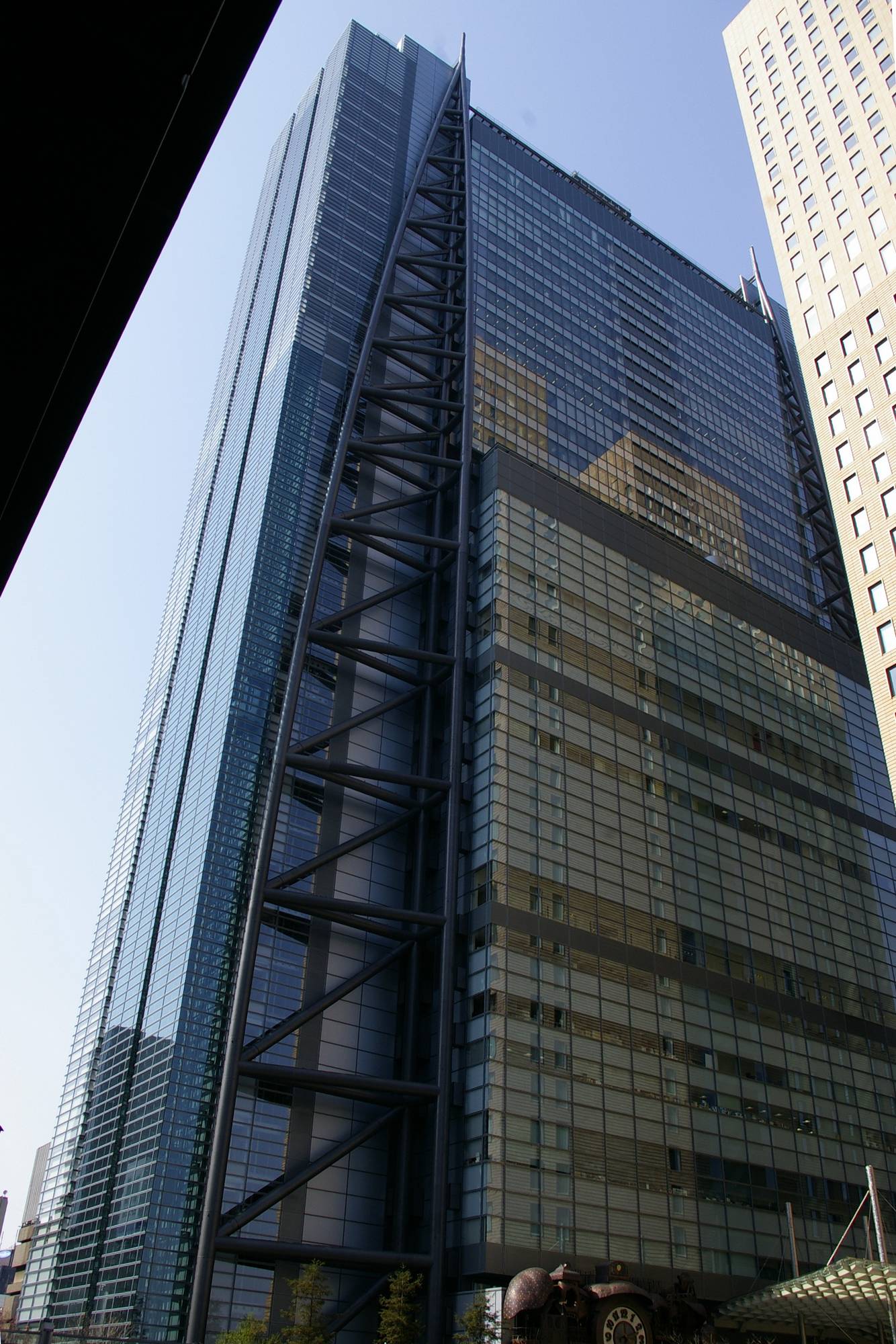
This was the answer to Fuji’s headquarter in Odaiba. Like many buildings in Tokyo this one is also split into areas for different purpose. In the lower half of the building are ste studios and above them the offices. You can see the both areas. The look of the building is dominated by the steel beams in the corners. They are no decoration but part of the building structure. The rest is covered in glass. The visible steel beams are remains from first sketch when the building had a complete exosceleton.

Nippon Television Headquarters and Dentsu Head Office

Dentsu Head Office
Ateliers Jean Nouvel, 2002

Also this building stands out. From one side it looks a little bit like a ship hull. From the other side it looks like the blade of a knife. There are no decoration elements. The power of this building comes from its ground shape alone. The reflectivity of the glass is a nice balance between full transparency of the windows and opaque elements between.

Check out the light effect at the top. I took this picture by accident. But the effect was planned by the architect. The reflectivity of the glass elements was changed. It now looks like the building is melting into the sky.

Relict of the past

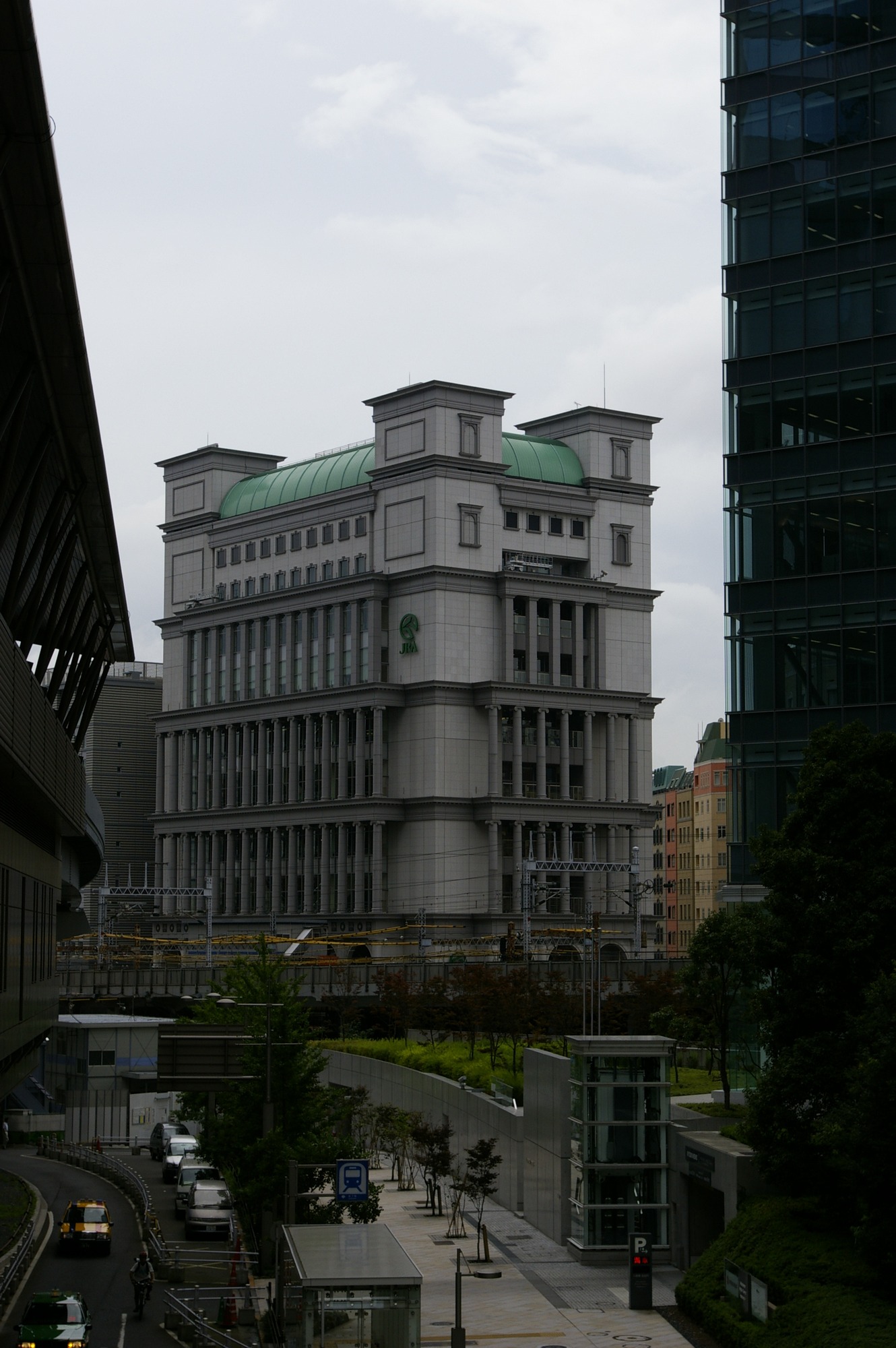
If you look carefully, between all this steel and glass there is an old building, that I need to mention. Just because it is so misplaced. It is an relict from the old Shiodome area.

Zwei Relikte der Vergangenheit

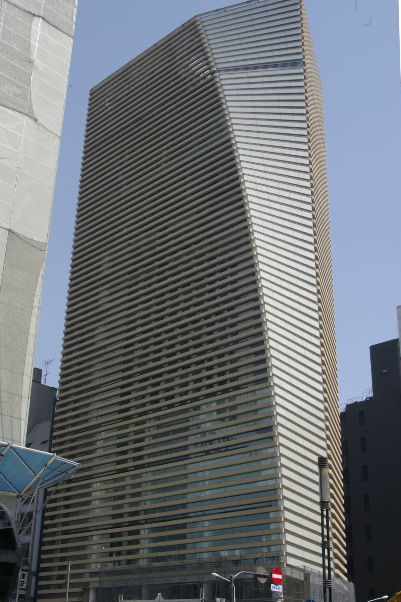
Capsule Apartments

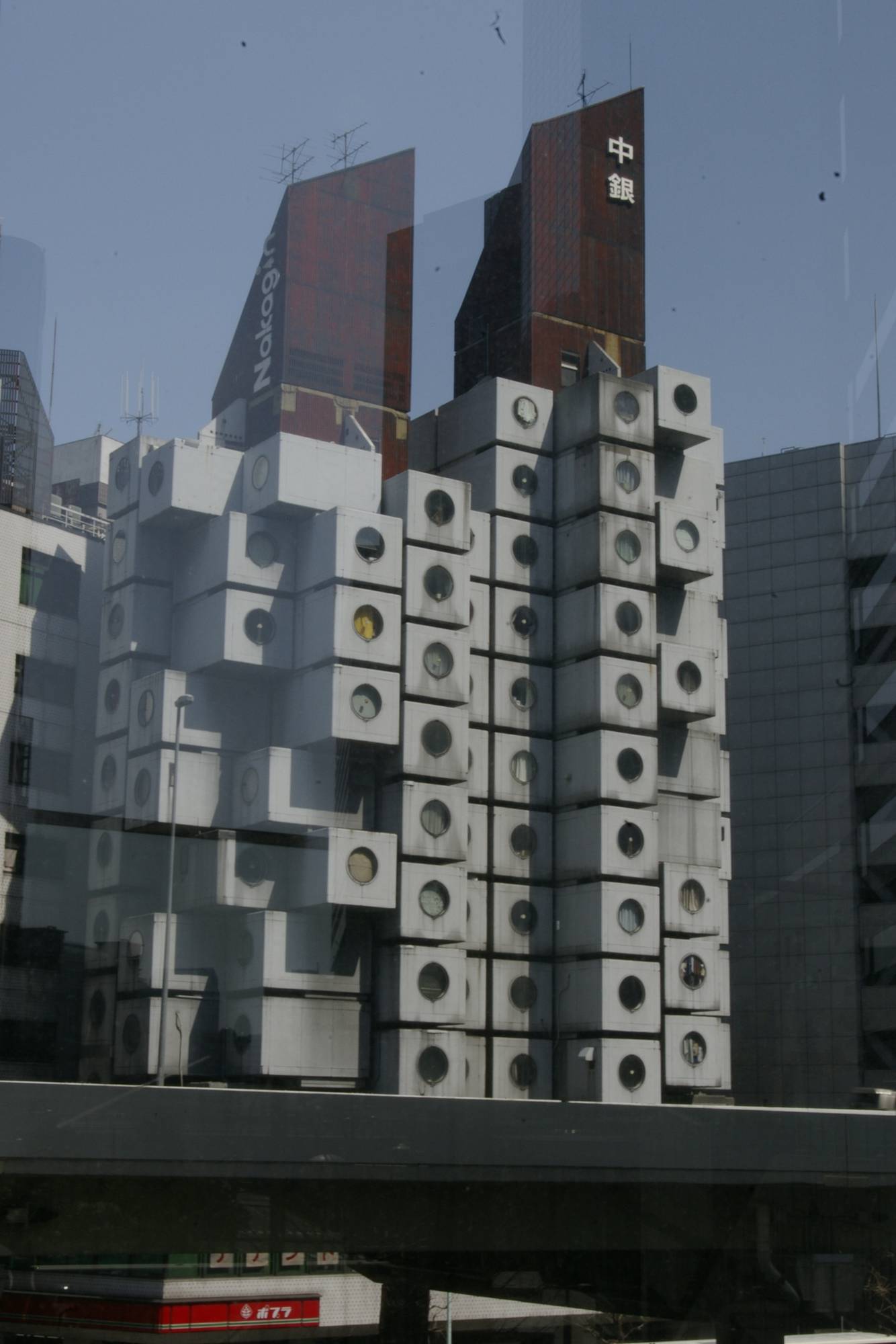
This famous building is planned to be demolished (situation in 2011). It is a witness of an older Tokyo. It was the attempt to modulize the city, to make the city organic. The concept: Each appartment is a cubilce that is attached to a central tower. If you need more appartments, you can cubicles, if you need less you can remove them. The building is adapting to the current need of living space. The Nakagin is a hotel. Only th bulleyes look strange. It is like a nightmare of living in the future, but it is a view into the history, when they tried to form a future that never came.

other skyscrapers in Shiodome

deutscher Blogeintrag

modern architecture – Shinjuku

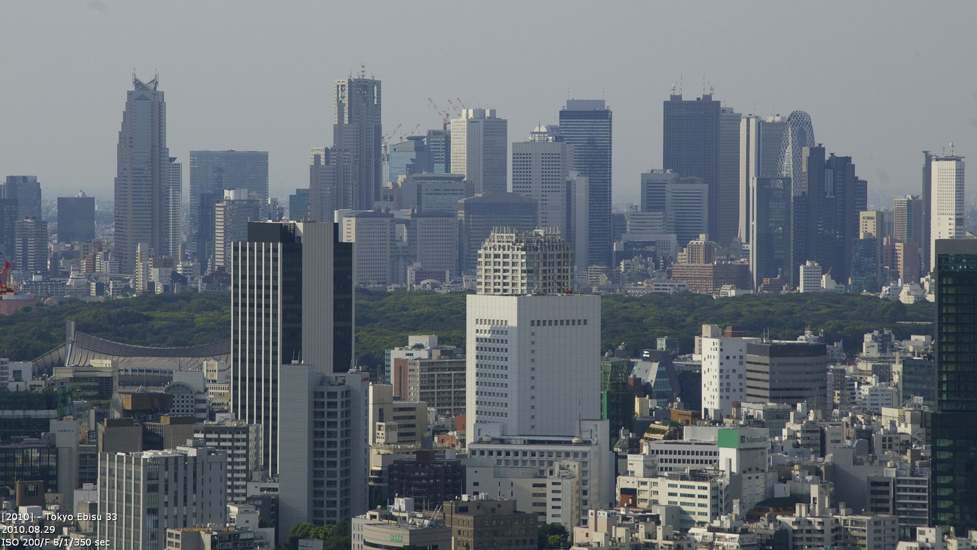
The tour thru Tokyo is starting in Shinjuku. Note: Shinjuku is not Tokyo. At least for the Japanese. Gaijins usually mean the whole metropolitain area if the say Tokyo, and also include Shinjuku, Shibuya, Roppongi and other cities. For Japanese Tokyo is only the area around Tokyo central station and the imperial palace. Shinjuku received it’s big rush during the bubble economy. During this time many buildings were built. One of the last was the metropolitain government building.

Shinjuku Skyline

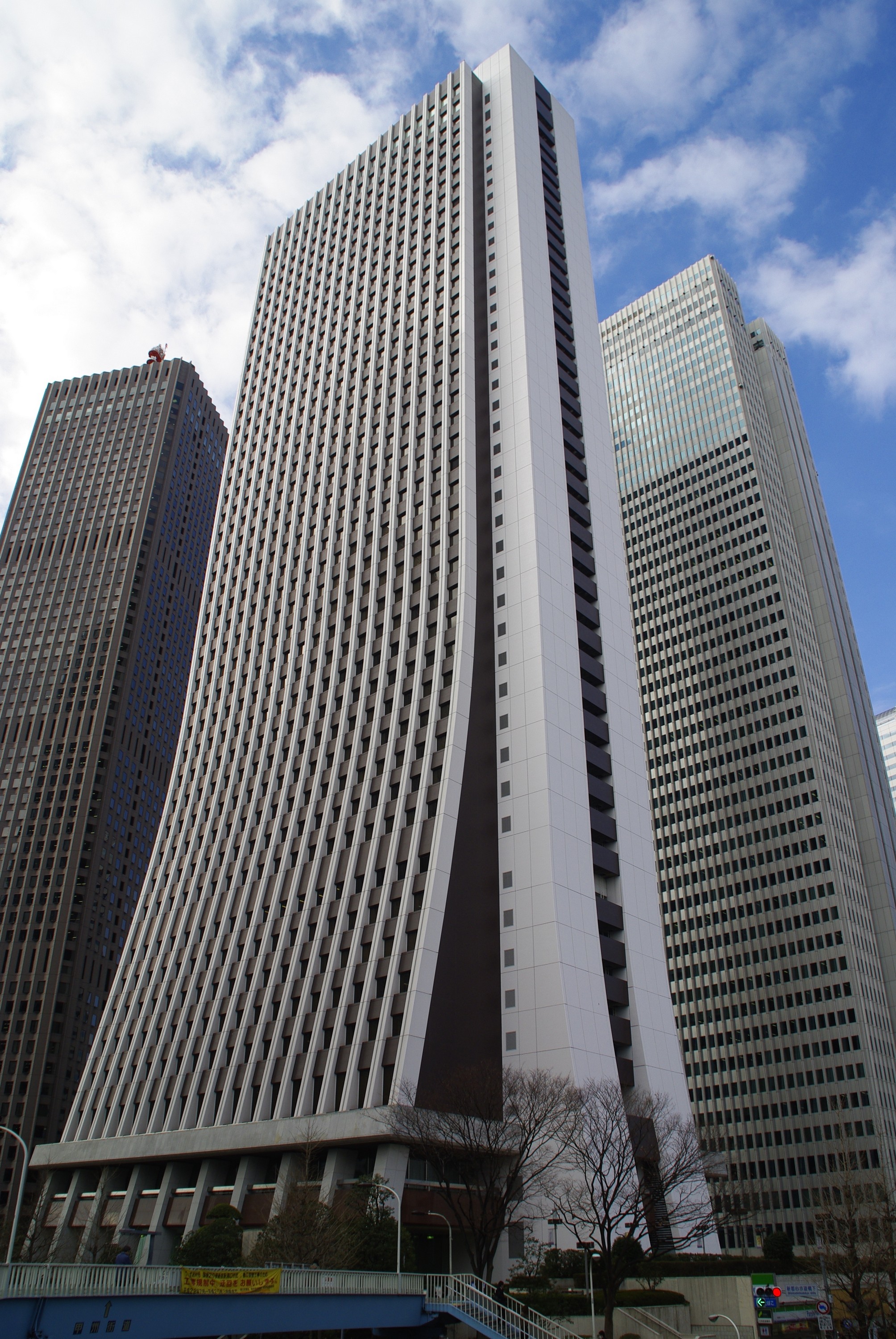
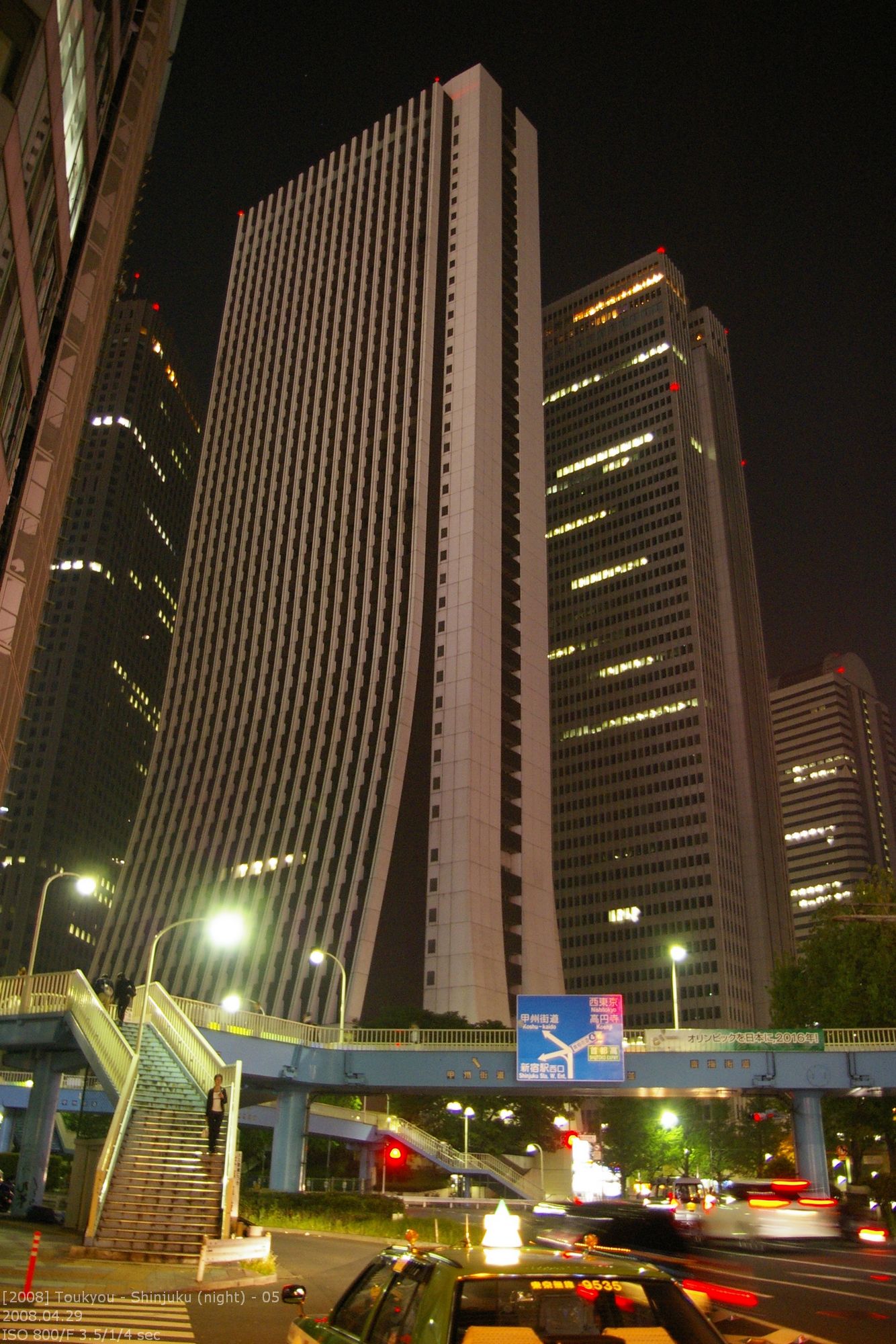
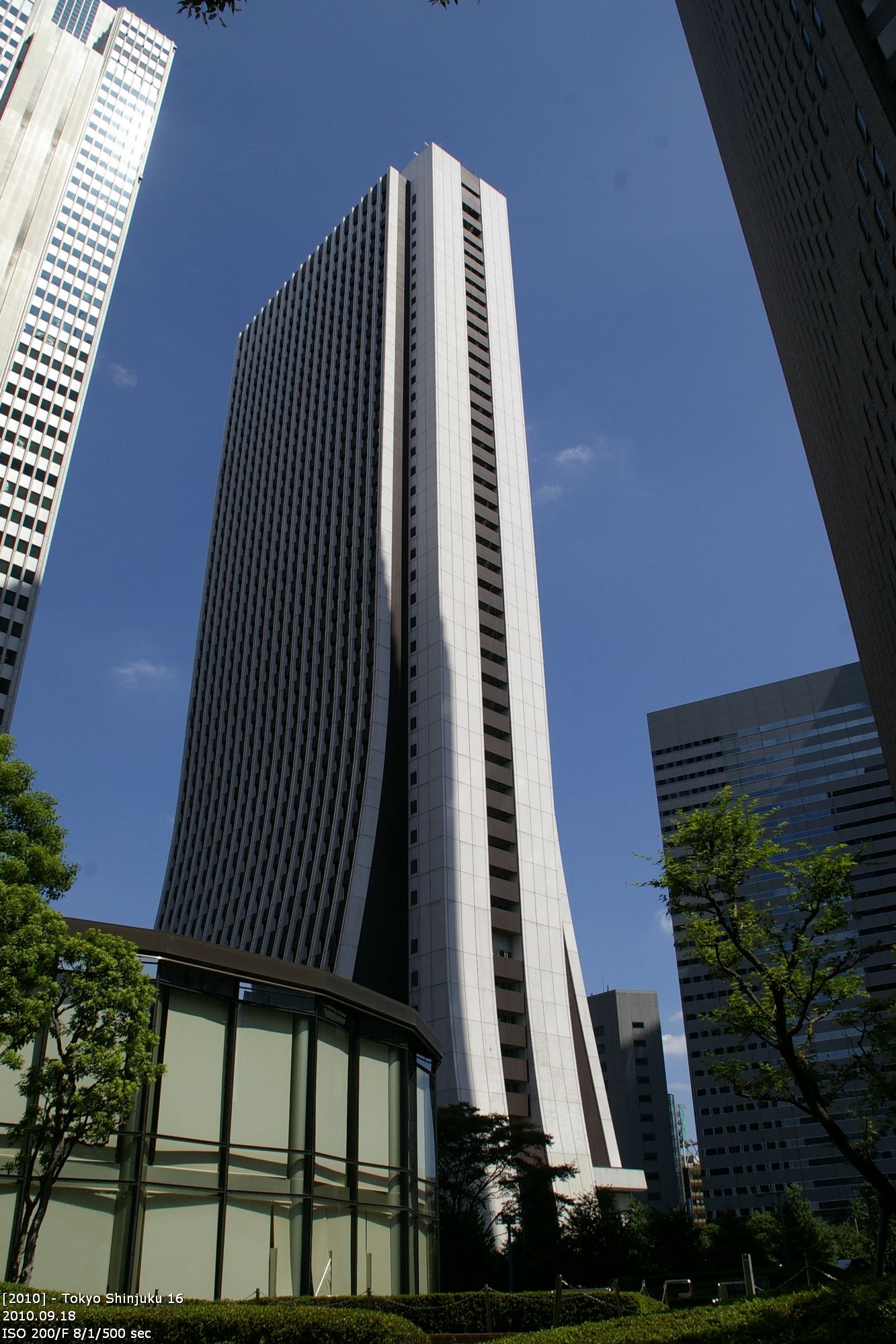
Sompo Japan Building
architect: Yoshikazu Uchida, 1973-1976, 200m, 40 floors

The Sompo building was designed by Yoshikazu Uchida and was built between 1973 and 1976. It was the landmark of Shinjuku for many years. Material, color and shape is a statement to the 70ies. The building has a height of 200m (antenna included) and 43 floors. In the 42 floor is a museum with a version of Vincent van Goghs sunflowers. In amime it was used as an indicator that the story is playing in Shinjuku. (e.g. City Hunter). The new landmark are the „Twin Tower“.

Das alte Wahrzeichen von Shinjuku

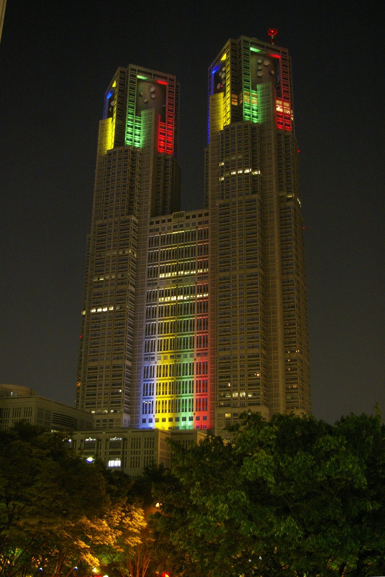
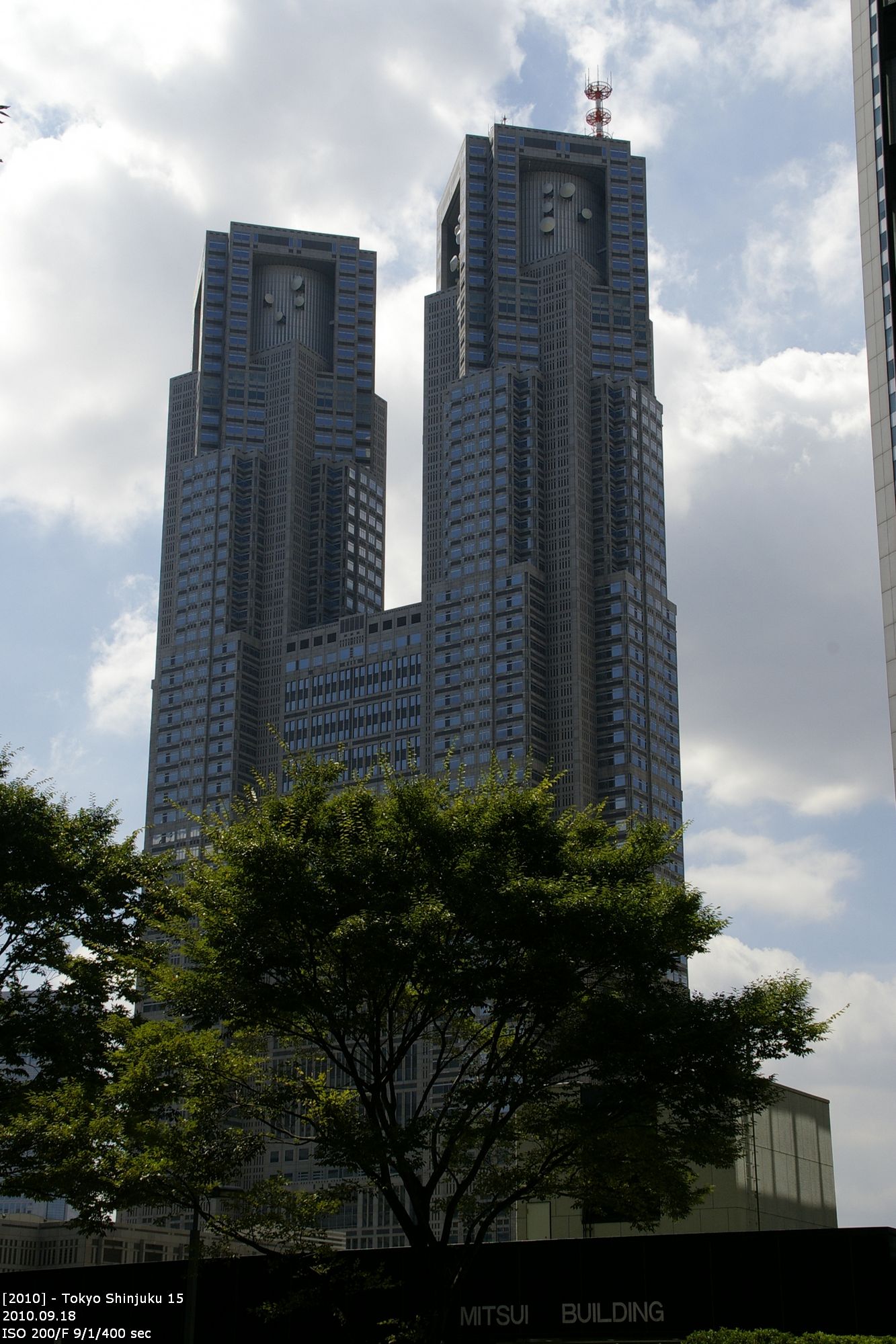
Tokyo Metropolitan Government Building
architect: Kenzo Tange, 1988-1991, 243,3m (No. 4 in Japan), 48 floors

The building is the office of the government of the Tokyo prefecture. It was designed by the architect Kenzo Tange. Before it was located at Tokyo Eki. This old building was from Kenzo Tange too. This old building was demolished. Today there is the Tokyo Itnernational Forum; another layout by Kenzo Tange.

The complex consists of three connected buildings The Twin Tower are building 1. The second building has 37 floors. It has three units with different height. The building is surrounded be streets and sidewalks in two levels.

The design has typical elements of Kenzo Tange. The verticals are dominant. The building is looking like a gothic cathedral, although Kenzo Tange is not using any gothic elements. But the resemblence to Notre Dame is obvious. And the design is just logical. Shinjuku was the center of the Bubble Economy and the money. Kenzo Tange placed the cathedral of this epoche into the center. His design is also a demonstration of the financial and political power of Tokyo. It is a momument of the megalomania of the 80ies. Therefore the building is also called バブルの塔 (Tower of Babel).

Das neue Wahrzeichen von Shinjuku

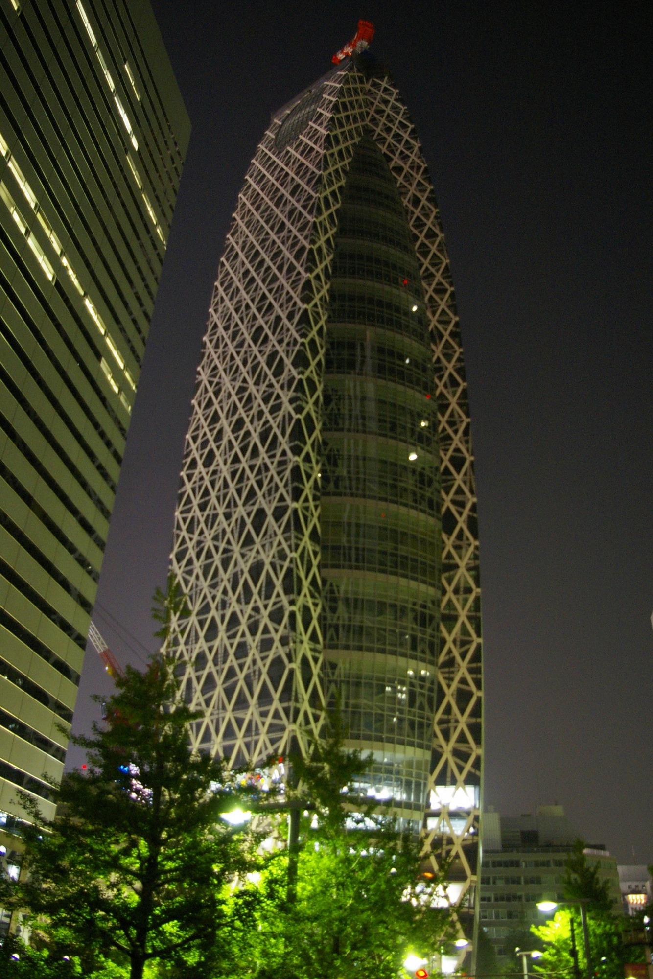
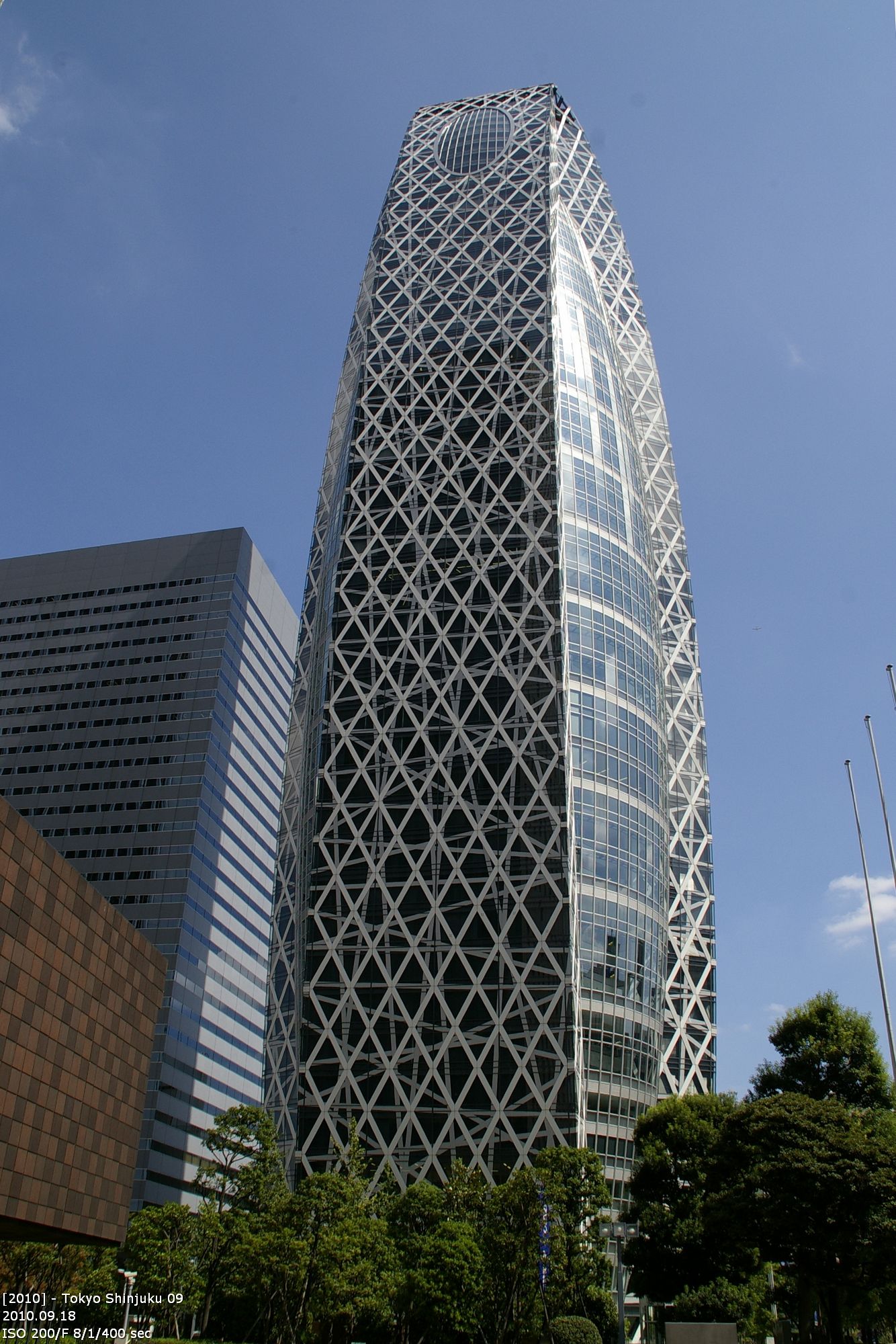
Mode Gakuen Cocoon Tower
architect: Kenzo Tange Associates, 2008, 204m

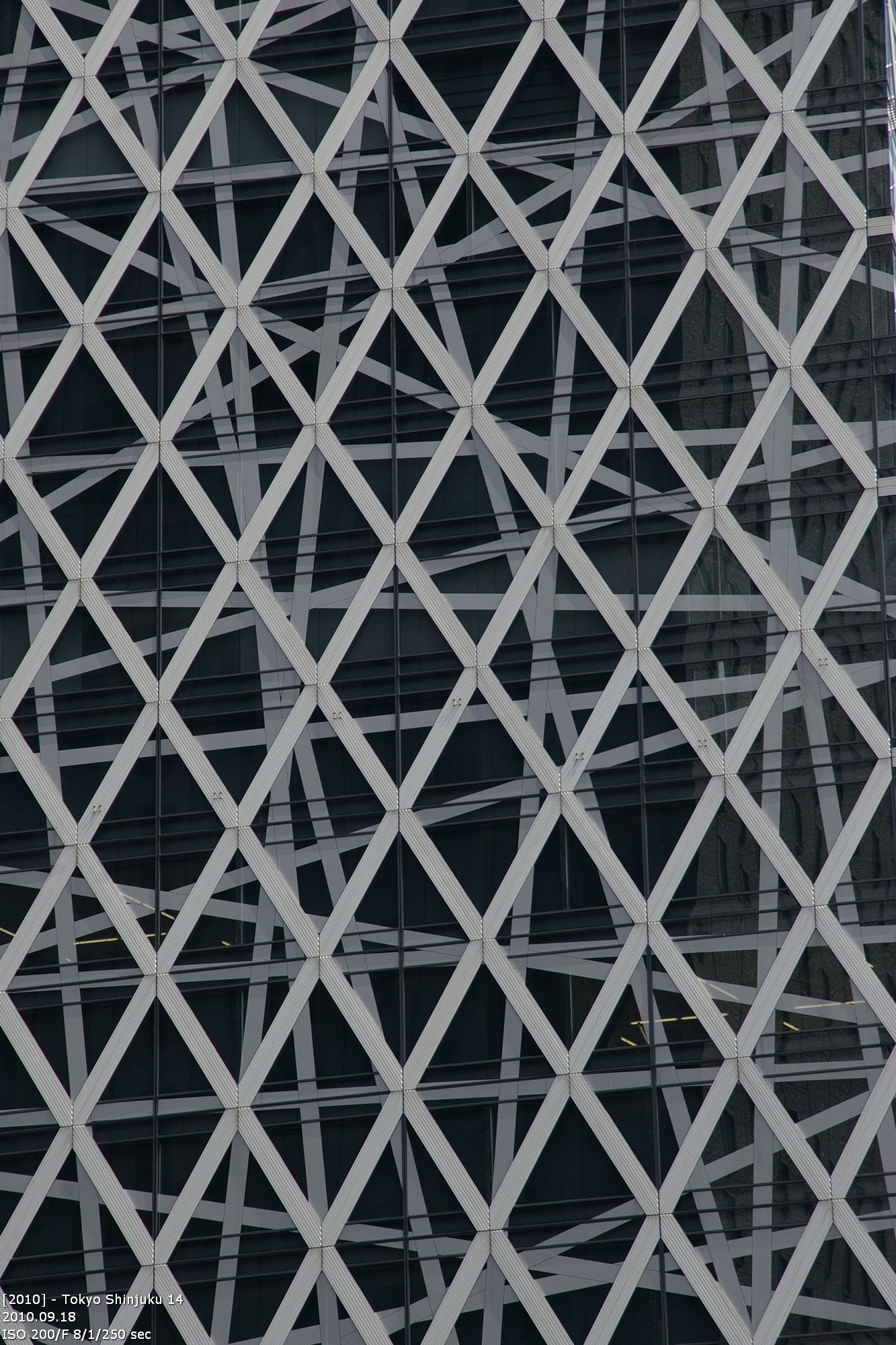
Beside this building, all other looks some kind of boring. This one really is an eyecatcher. The Cocoon Tower was finished in 2008 and only has a height of 204m which put him on place 17. (Funny, I cannot remember the construction side in 2004 and 2006). The design is from Tange Associates, a group of architects around Kenzo Tange. The building won the medal of Skyscaper of the Year. Tange won against 50 other competitors. There was only one rule: „Everything but rectangular“ The building is similar in shape and size to the Swiss Re HQ in London. But thats all. The building is covered with blue glass, that gives a free view to the aluminium construction underneath. This construction is the reason for the name cocoon.

Inside the building is the fashion school. Therefore it is the highest university building in the world. The cocoon shall cover the new ongoing designers and protect them until they are ready to face the world. Maybe it is because of the other architects involved, but Kenzo Tange is leaving his old habit of dominate the verticals. The design misses all his typical elements, that partly originated at Le Cobusier. With breaking with his old rules he also broke with a lot of convention of standard building design.

Universitätsgebäude Coocon Tower

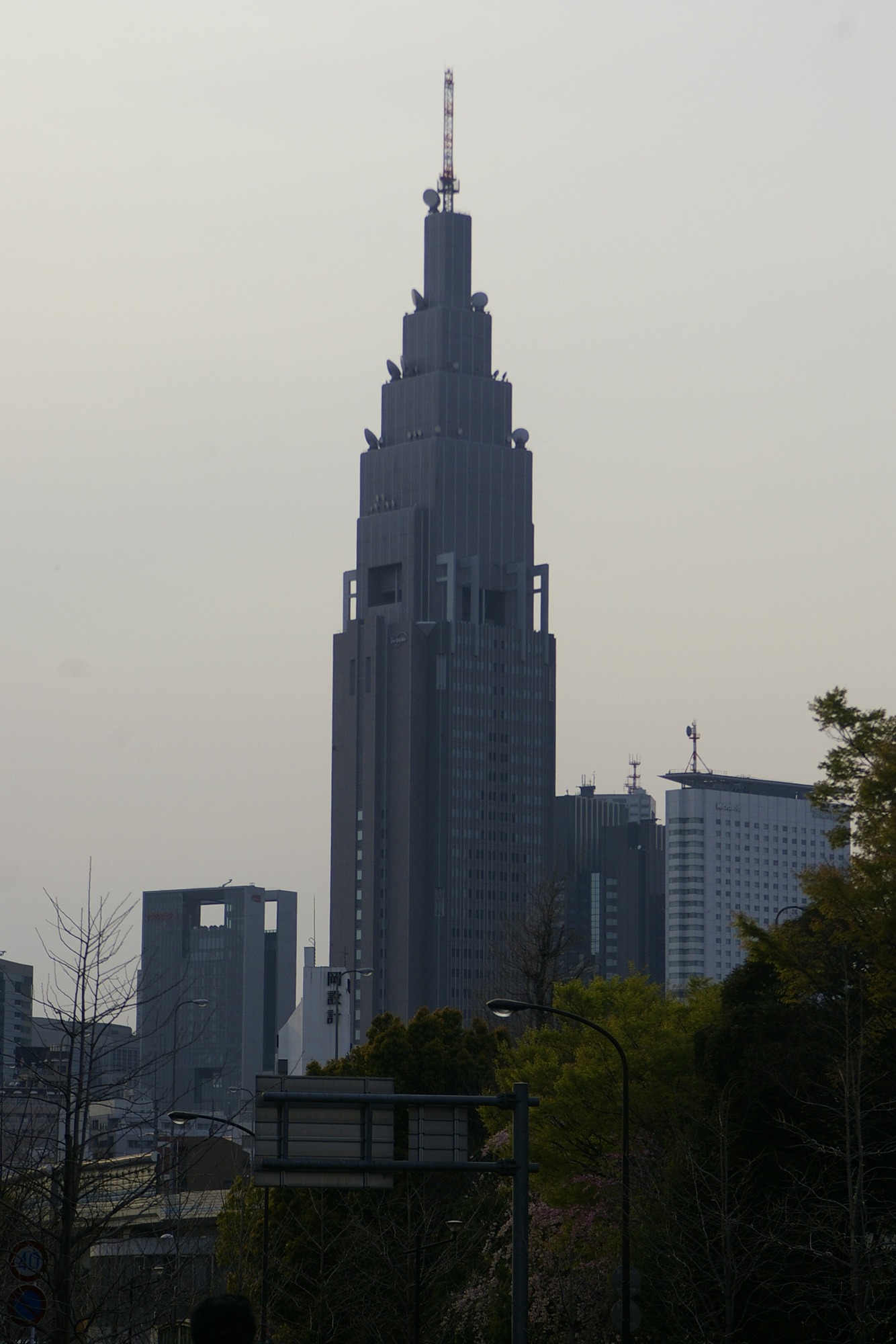
NTT DoCoMo Yoyogi Buildung (links)
architect: Kajima Design, 2000, 270m incl. antenna

This building was part of an development project for the southern region of Shinjuku. It became the landmark of the Yoyogi area. It stands out, because it is not surrounded be other tall buildings, but by Yoyogi park, Meiji shrine and Shinjuku Gyoen. The building is seperated in three funtional units: in the lower third there are restaurants and shops. In the middle 27 floors are the offices of NTT DoCoMo. The upper half of the building is the third unit. It contains all telecommunications technics. Beside its height of 240m the building only has 28 floors above ground level.

The top of the building is stepped and reminds of the american sky scapers of the early 20iest century (like the Chrysler Building). It stepped top takes away the weight of the constructions. Noticeable are the riders at the point where the relief begins. This is a citation of the gothic archtectural language. Also noticeable is the 15m big clock, the can be seen from the Shinjuku side.

Mitsui Building und NTT DoCoMo Building

Shinjuku Mitsui Building (rechts)
architect: Nihon Sekkei Inc., 1974, 225m, 55 floors

Text folgt …

deutscher Blogeintrag